
SQL + Tableau
Online Cinema Project
Research key KPIs of new users by education sources.
Choose marketing strategy we need to engage in in the future.
SQL + Tableau
Food Delivery Project
Explore and visualize key monetization metrics.
Conclude whether the product pays off.
Recommendations to the business.
SQL + Tableau
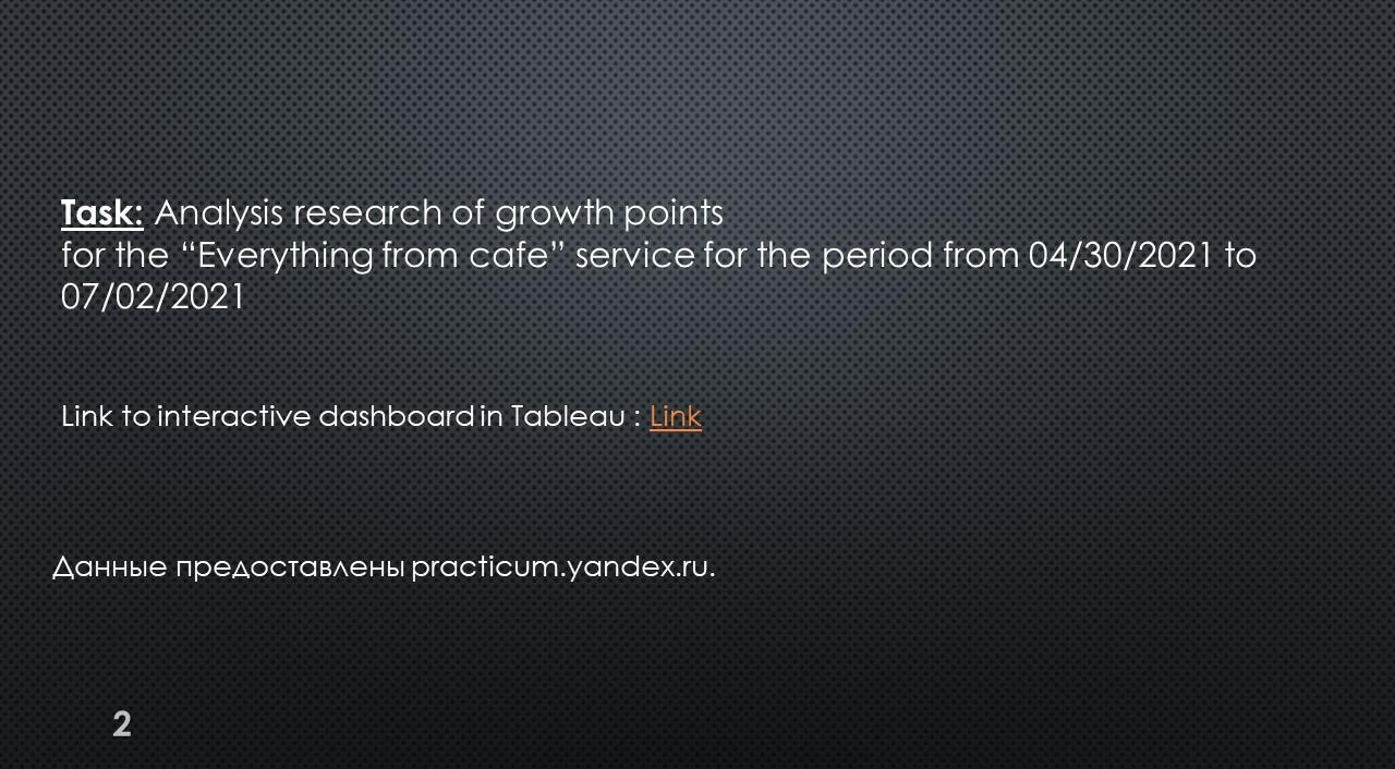
Research of Growth Points for Food Delivery
Explore and visualize product growth points.
Draw conclusions and hypotheses.
SQL + Tableau
Preparation and analysis
of the A/B test
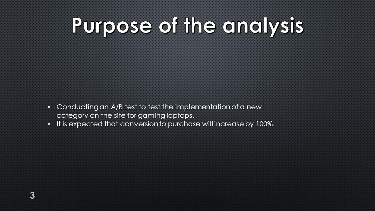
Conducting an A/B test to test the implementation of a new category on the site for gaming laptops.
Excel
Sales Company Data
In this project, I explore sales data in a company in different States over a period of three years.

Python/SQL/GCP/Mage
NY Uber data analysis
The goal of this project is to perform data analytics on Uber data using various tools and technologies.
Power Bi
AtliQ Data Exploration
In this project, I do full data exploration, building key metrics and data visualization.
Power Bi
PWC Call Center Exploration
In this project, I analyze the data of Call Center. I had three different tasks from three different divisons of the company.
Power Bi
KPMG PowerBI Project
In this project, I work with the "Sprocket Center" bike company data. I analyzed the data of clients.

Python
Loan Predication
My project is predicting the likelihood of a bank loan being approved based on financial and personal data of borrowers using machine learning.

Python
British Airways Project
A project in which I collect data on passenger reviews from the site, analyze this data, and also build a model to predict bookings.
Certifications


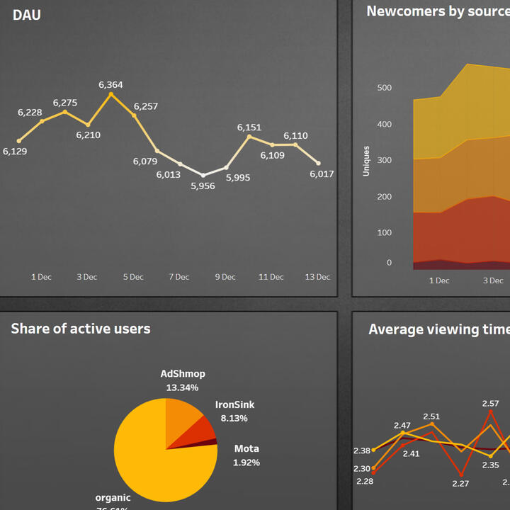
SQL + Tableau | Online Cinema
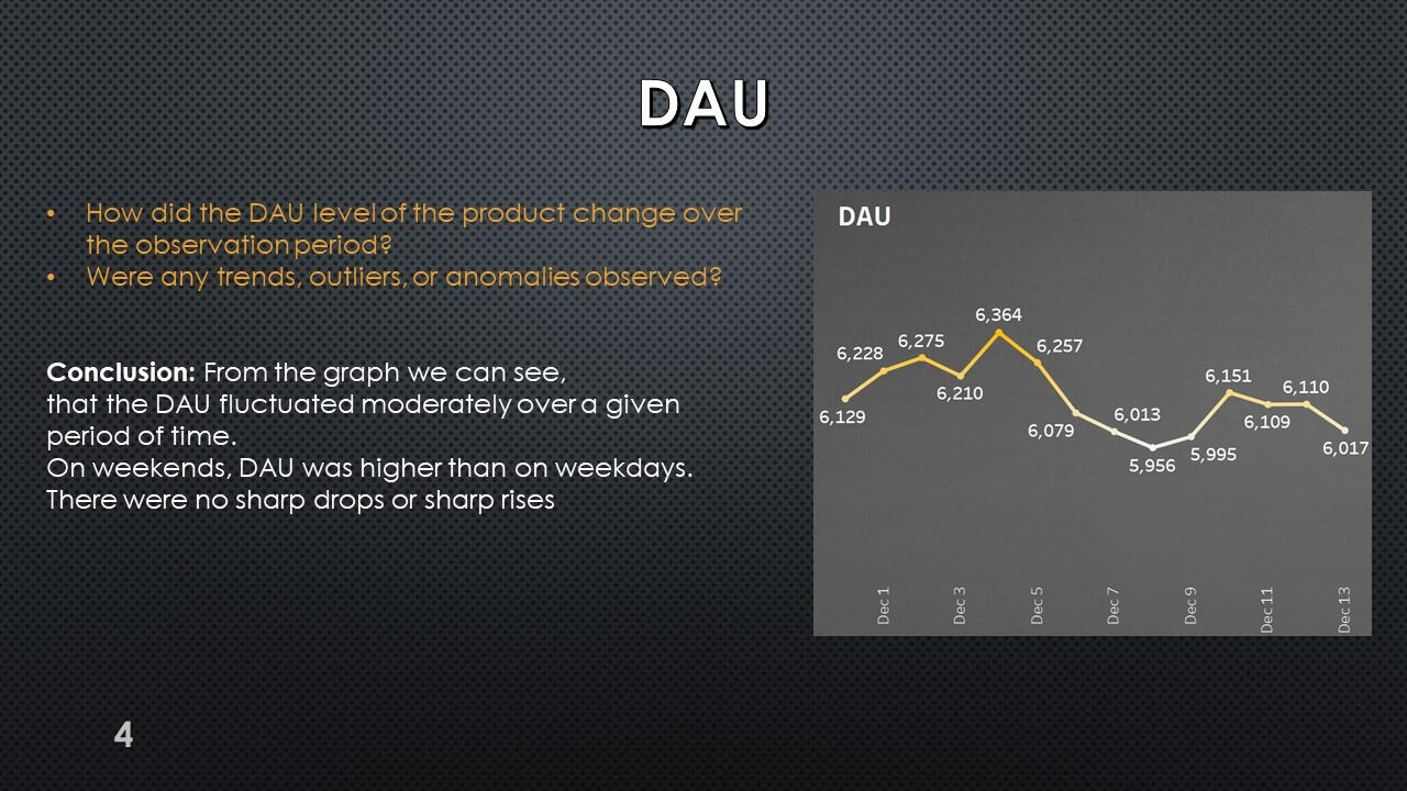
Query to obtain DAU and count the number of analytical events per day.
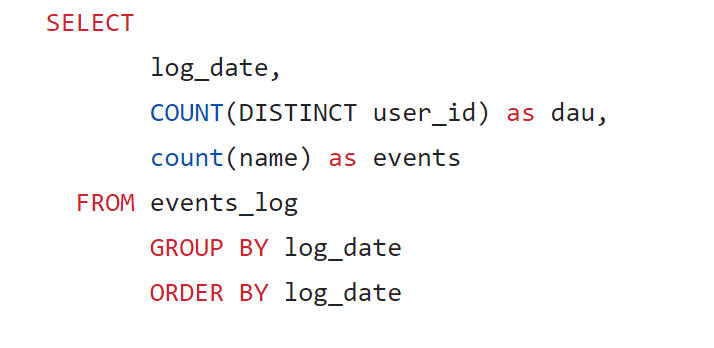
It can be seen that about 6 thousand users visit the product daily. They generate approximately 60 thousand events per day.
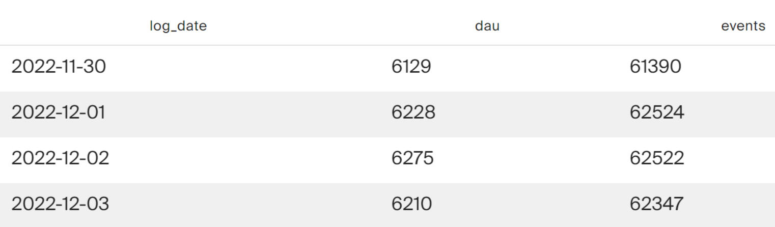
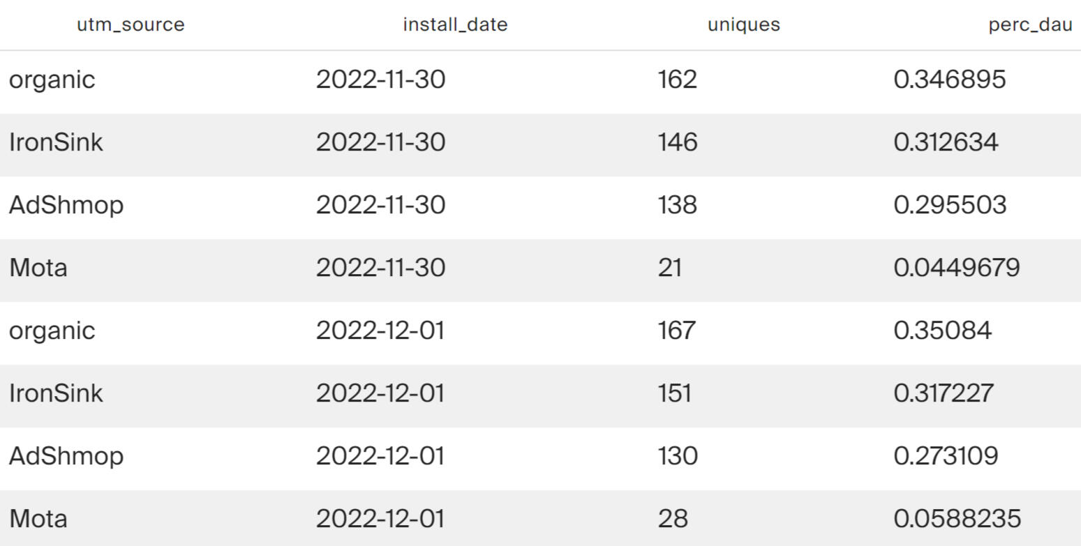
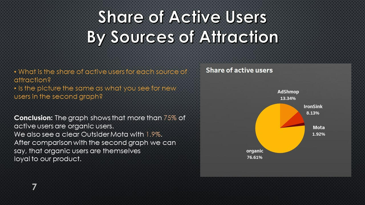
A request to obtain a calculation of the number of unique users who visited the service from different acquisition sources.
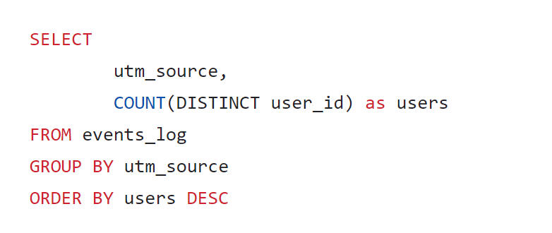
The query results show that most active users were not attracted by advertising sources, but came themselves (organic channel). Among the advertising sources, AdShmop attracted the most attention.
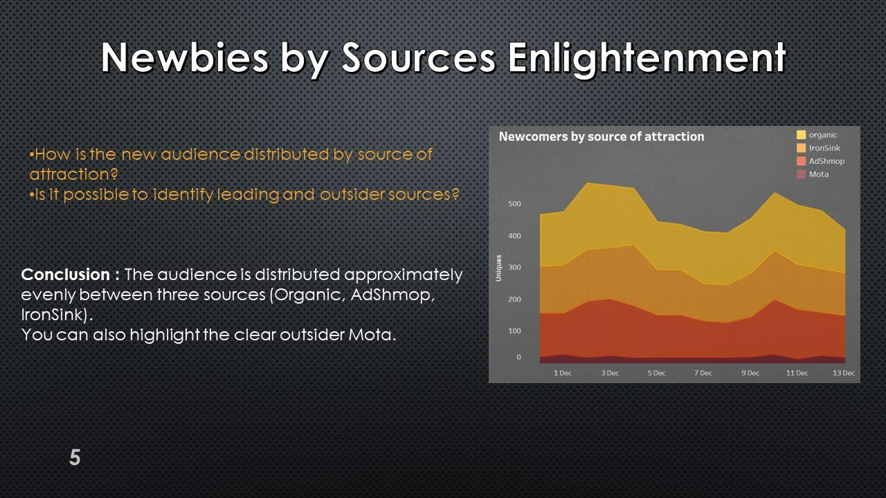
The volume of new users attracted to the application on each day.

The query result shows that every day each of the channels - organic, IronSink and AdShmop - attracts about 30% of new users each. An outsider in attracting new users is the Mota advertising network.
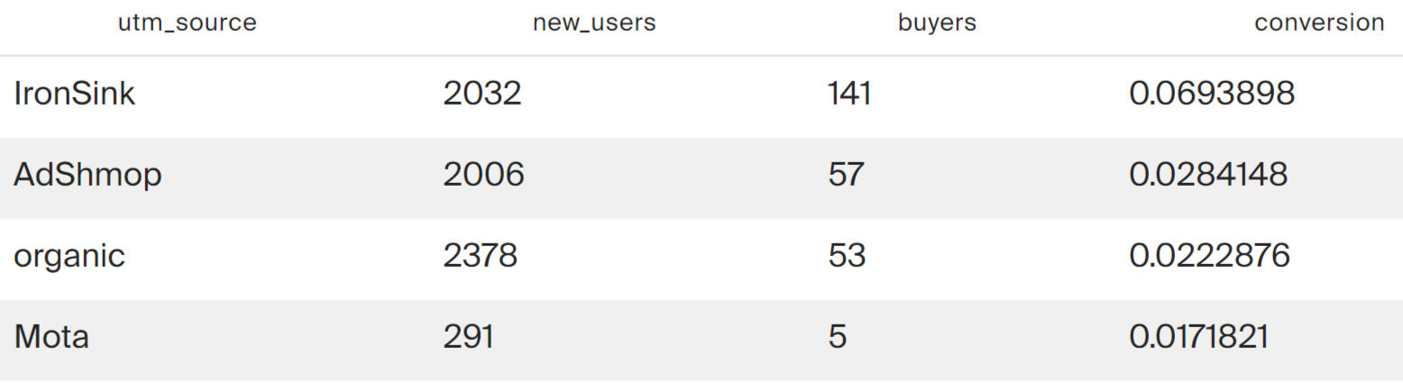
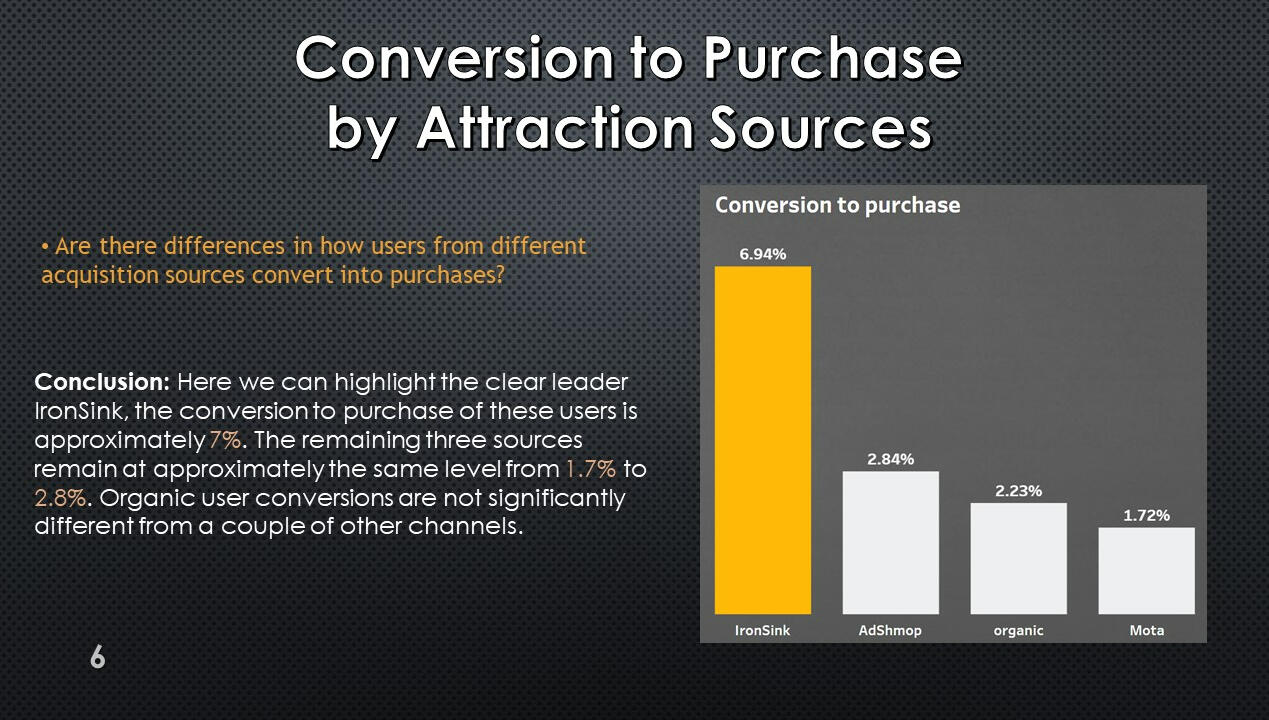
Conversion to purchase for each source of attraction for the entire observation period.
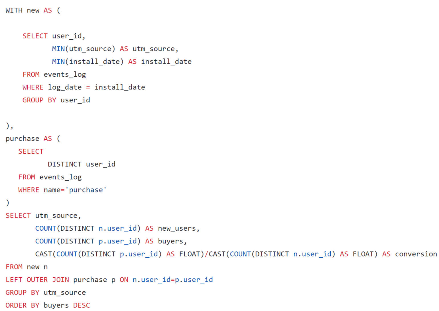
The previous query showed that Mota is an outsider in terms of the absolute number of attracted users. This channel is inferior to everyone except organic in terms of conversion. And the conversion leader is IronSink.
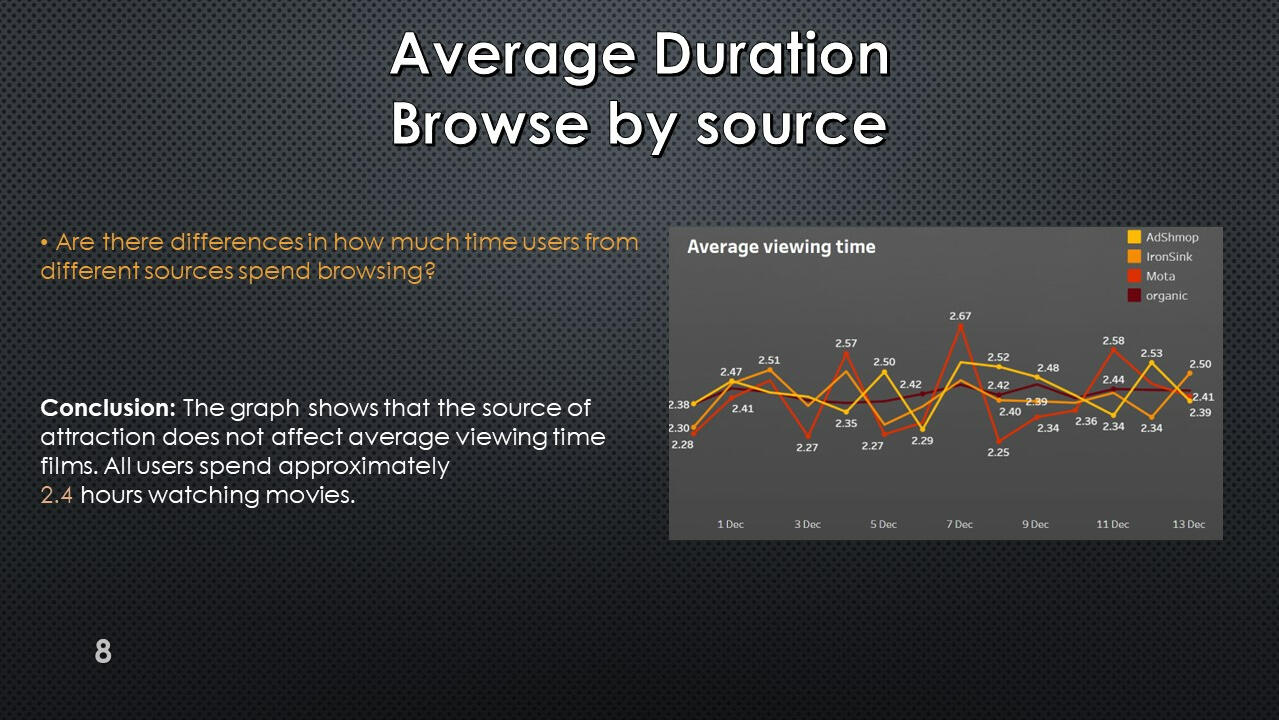
Average movie viewing time
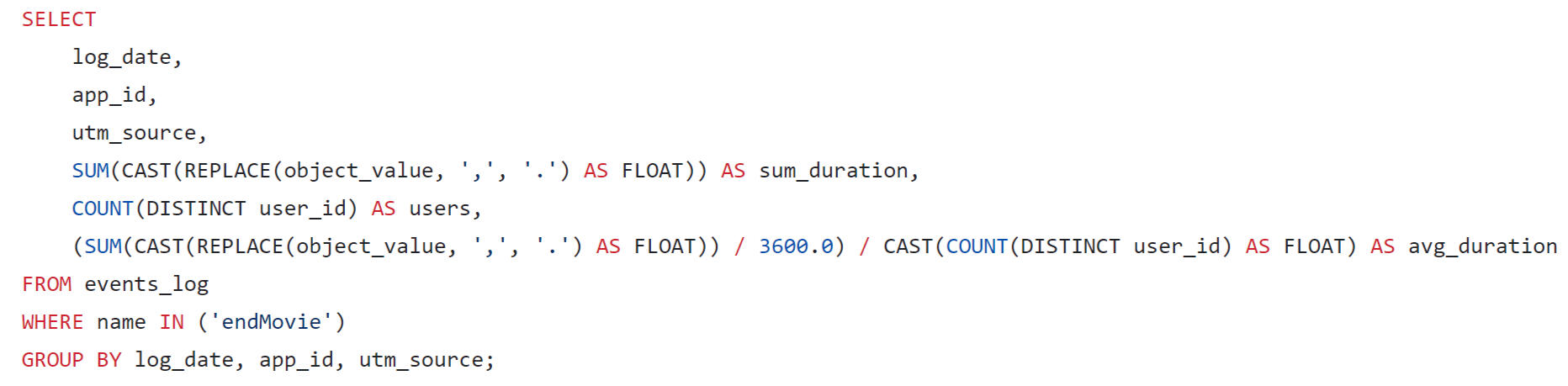
The results show that on average, users attracted from all sources spend about 2.5 hours watching movies.
Using Tableau Public, I developed a dashboard “Online cinema user activity”: Link
Presentation with conclusions and observations:


This project was made with data downloaded as a CSV file from practicum.yandex.ru- Analysis done with SQL
- Dashborad created with TableauThe project can be viewed on my GitHub: This Project
SQL + Tableau | Food Delivery Project
Project Description:
A query was written using SQL to estimate the LTV for the dashboard. When forming a request, you need to consider that:
1. It is necessary to take such an interval of user acquisition dates that all new users can live in the system for 7 full days.
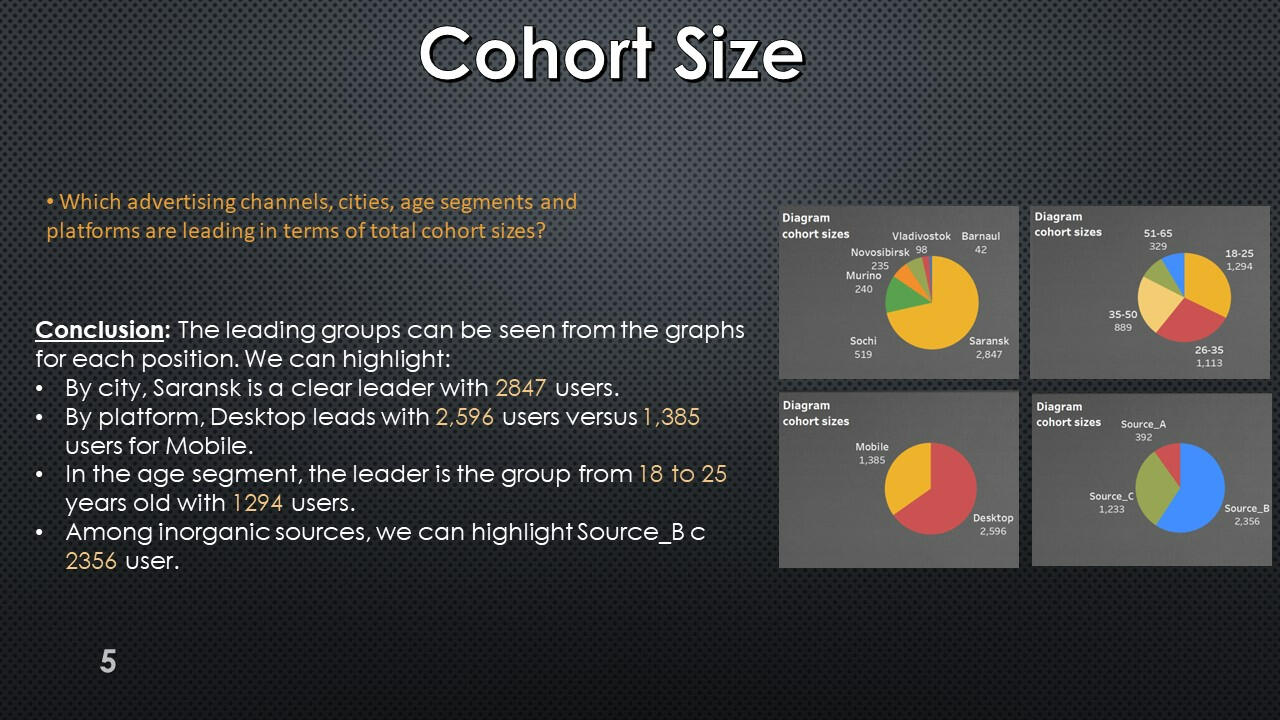
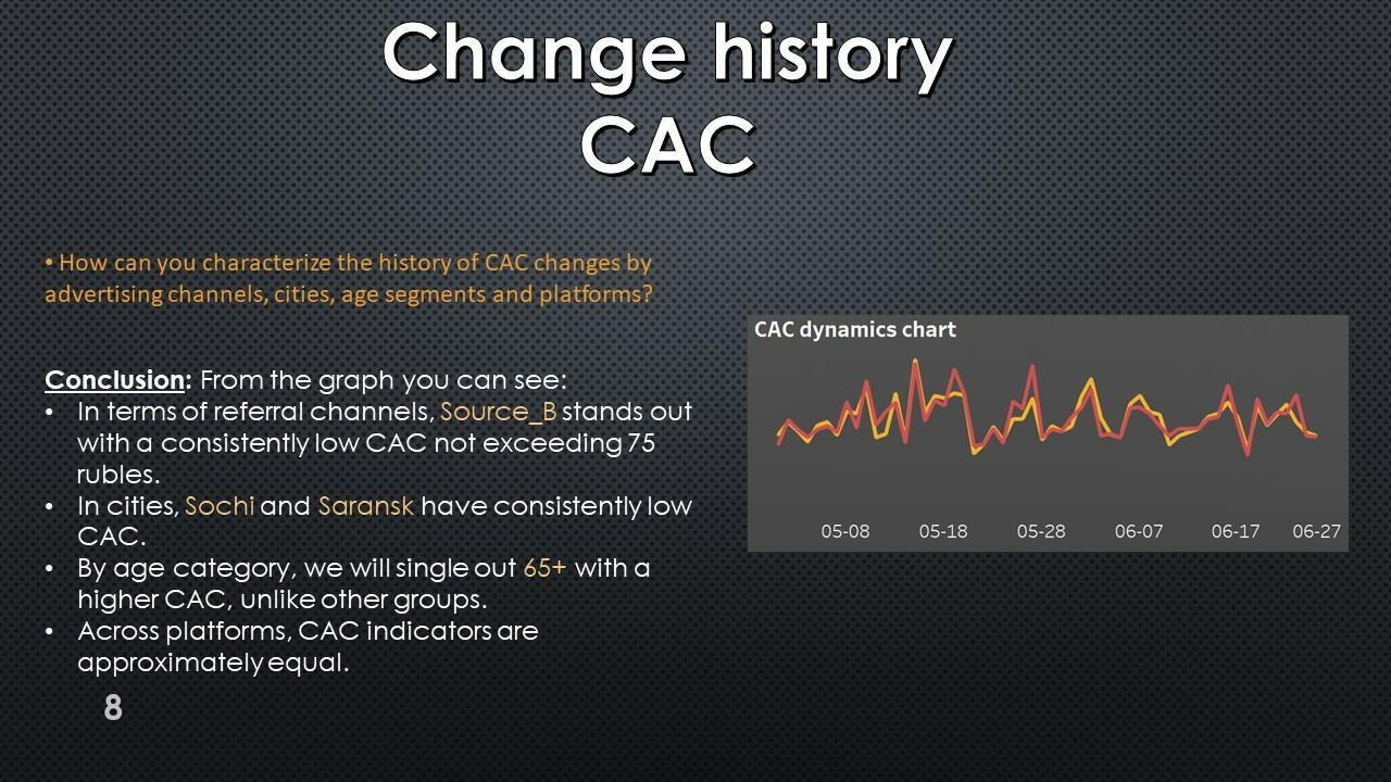
2.In the dashboard, users should be segmented by platforms, cities, age segments and acquisition channels.
Initial user settings
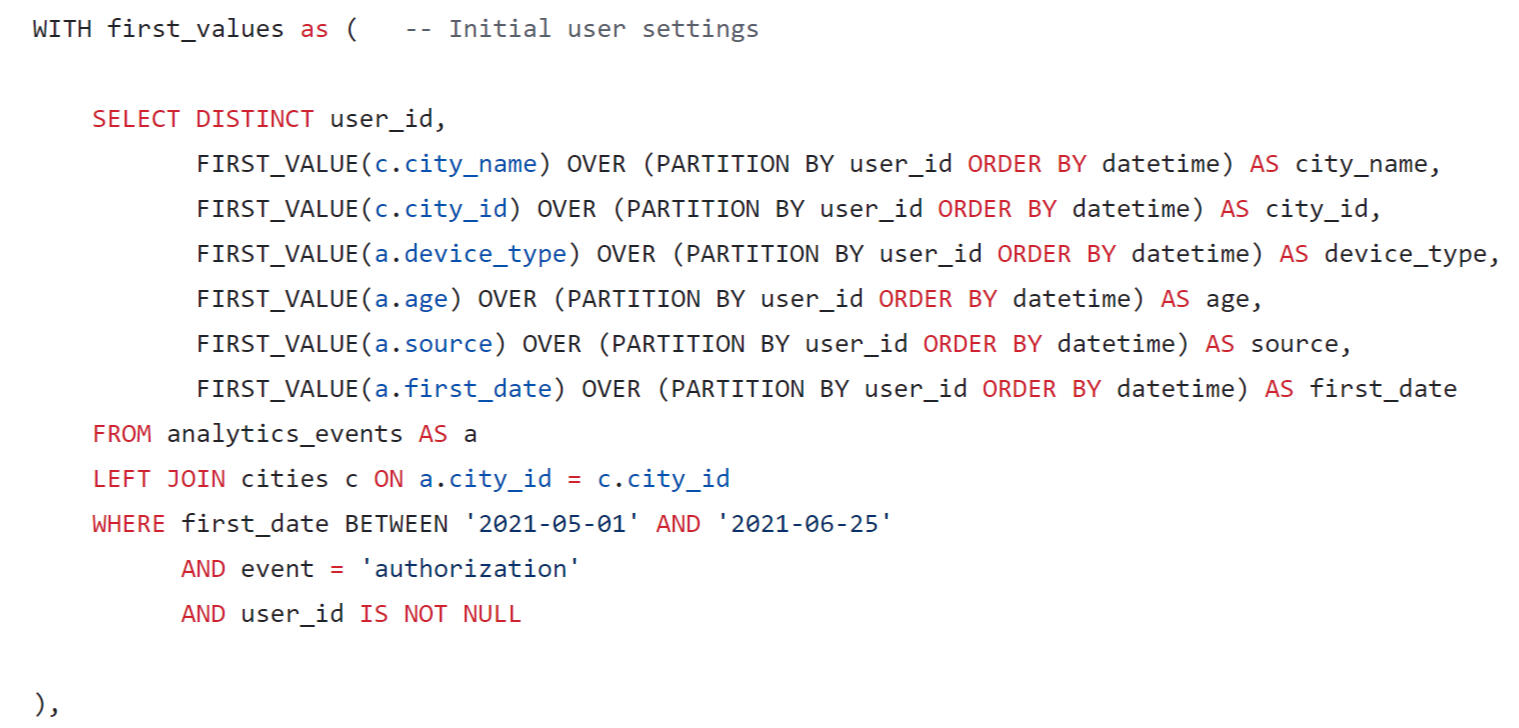
The initial parameters of users were found: citiy name, city id, device_type, age group, source and first date of registration.
New users by day for CAC calculation
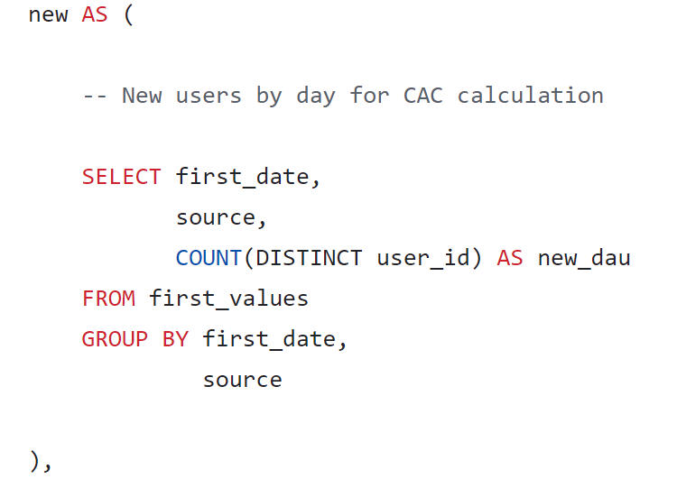
New users found by day.
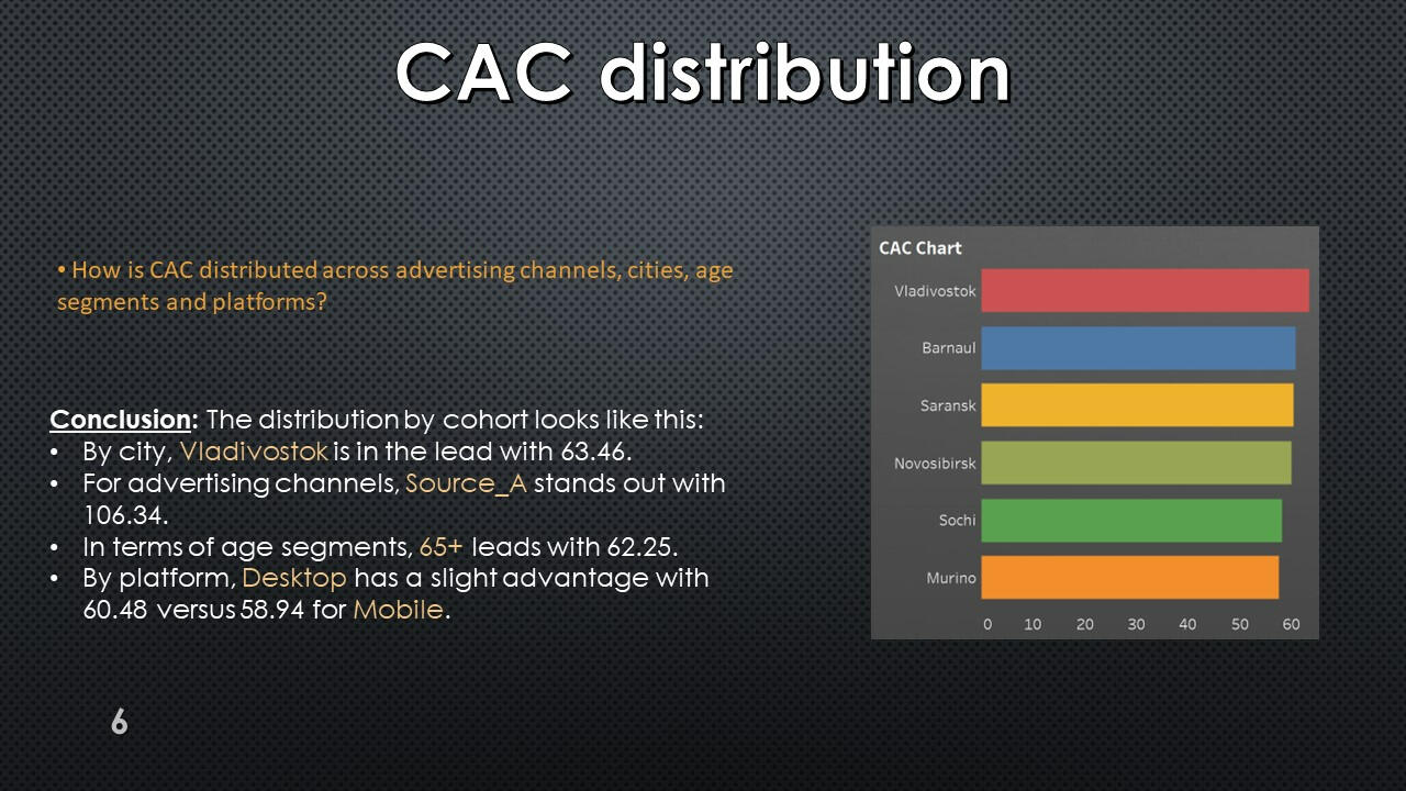
CAC calculation
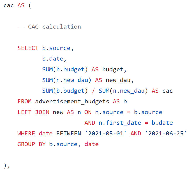
CAC was found by dividing the advertising budget by the number of new users
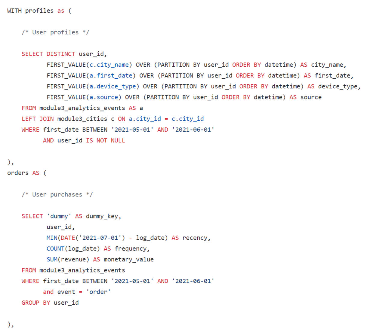
Formation of profiles
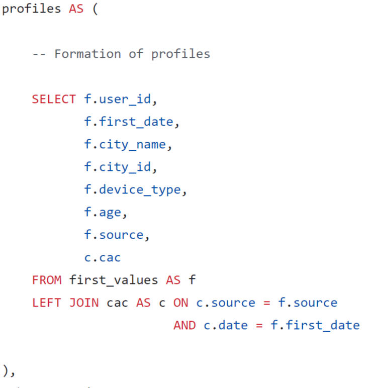
A user profile was generated taking into account the conditions of the task.
Formation of cohorts
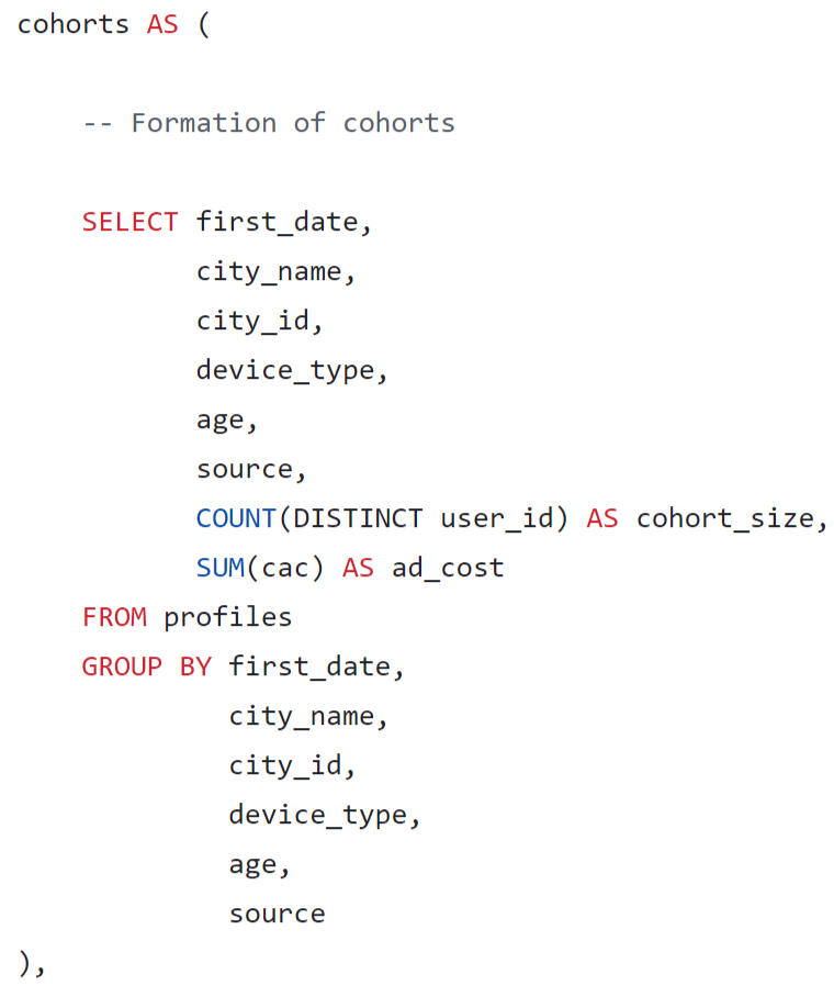
Cohorts were formed by date, city name, city id, device type, age group, source.
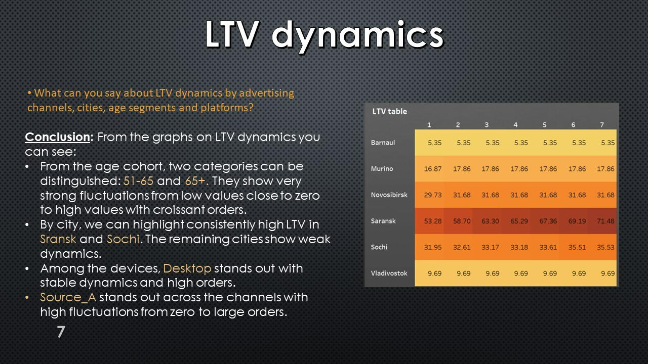
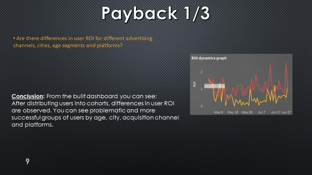
Daily revenue
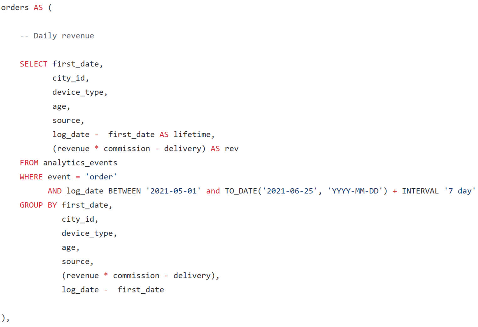
Lifetime and revenue of the delivery service are calculated for each order.
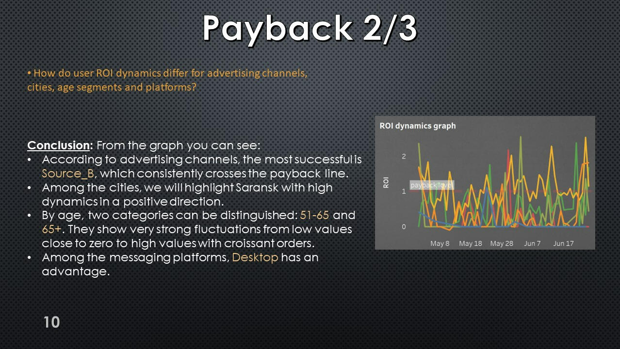
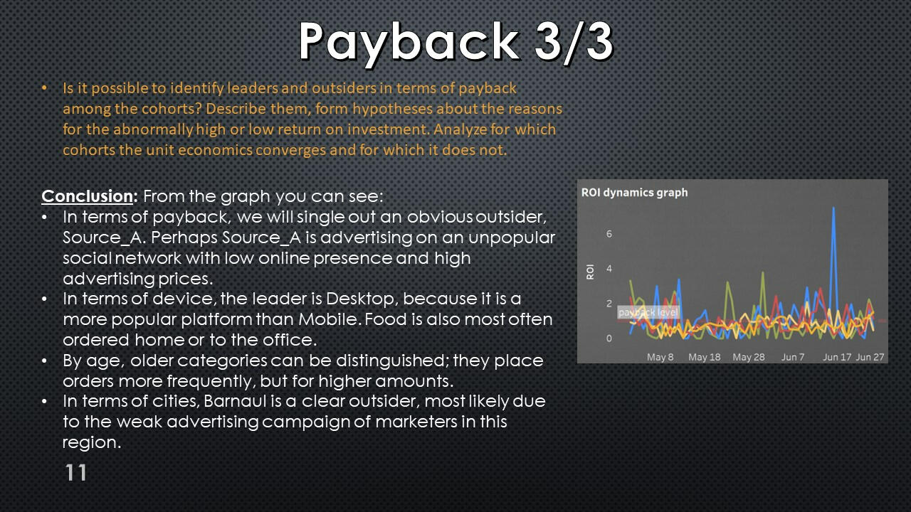
Revenue by cohort
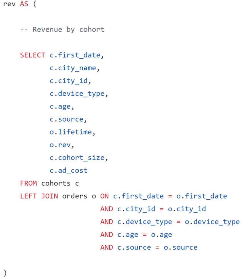
Revenue by cohort was calculated by joining two tables.
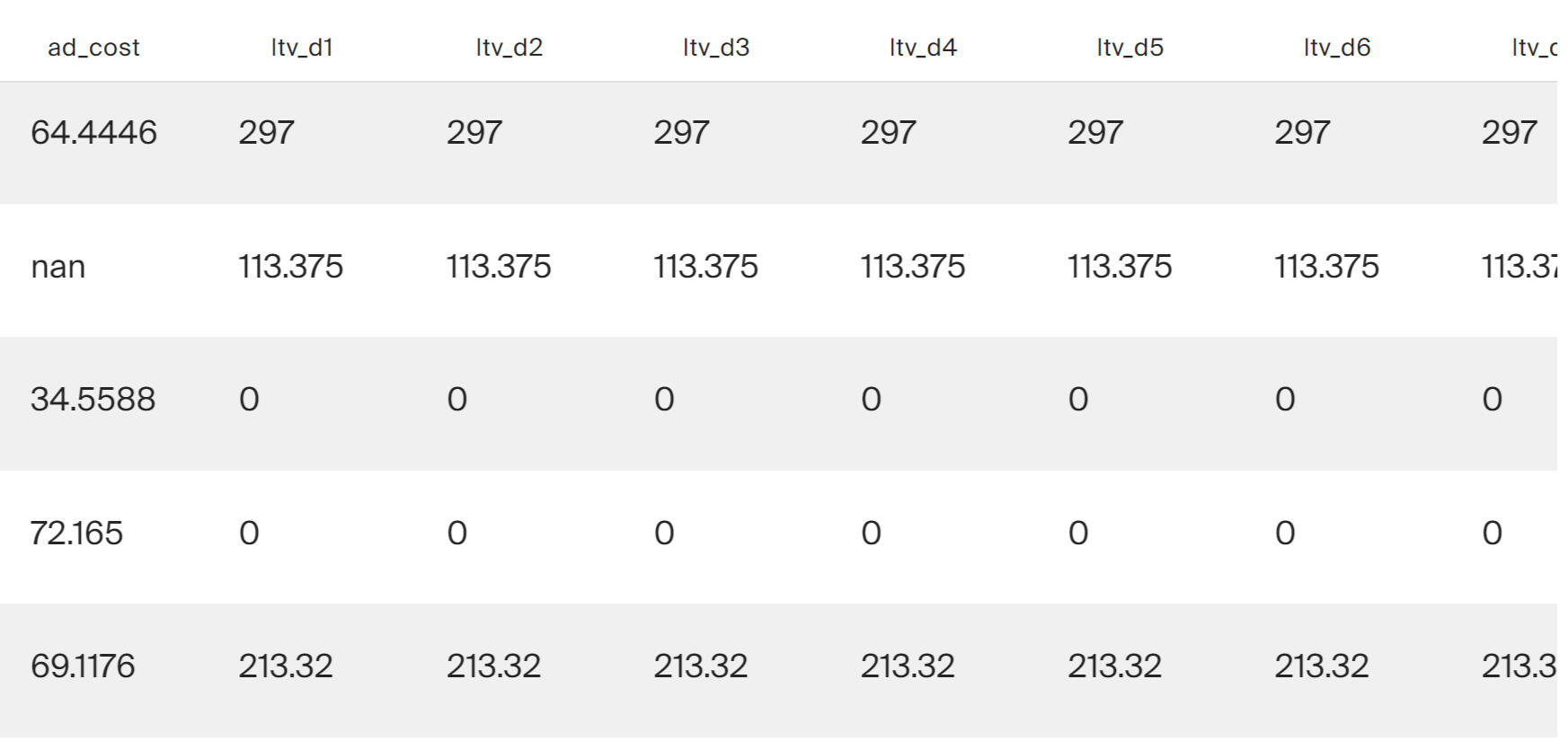
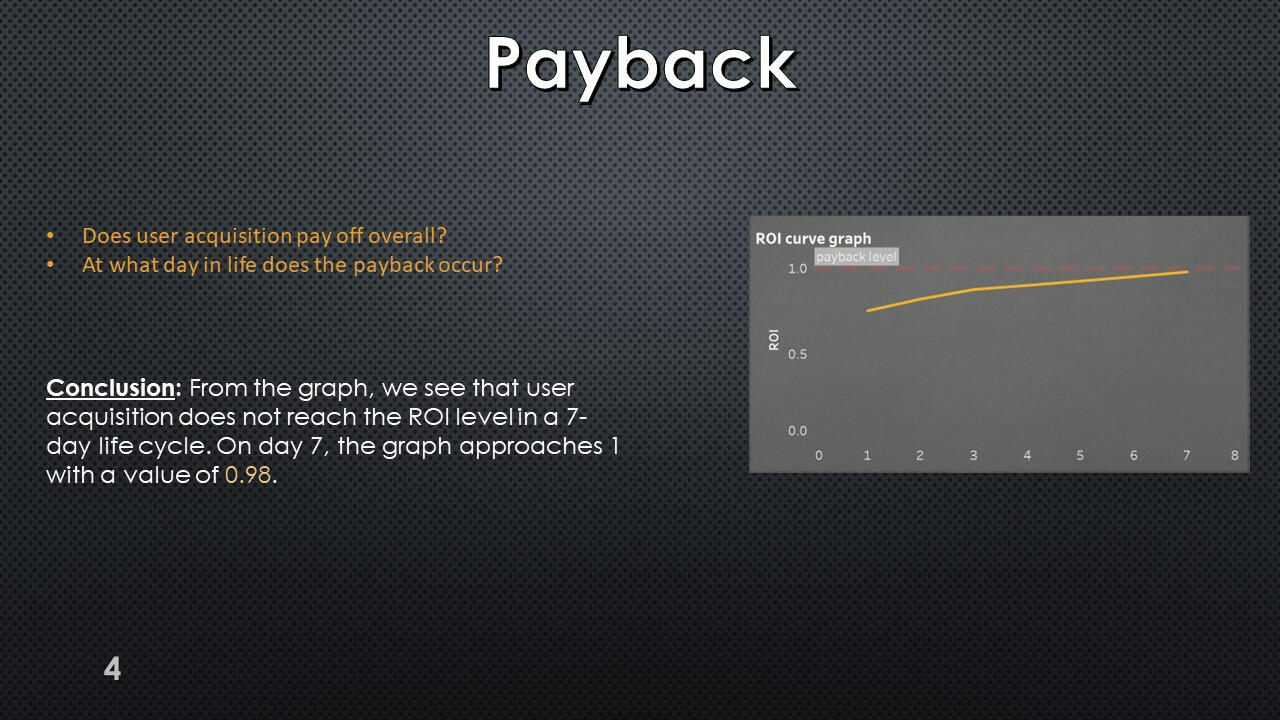
Final Result
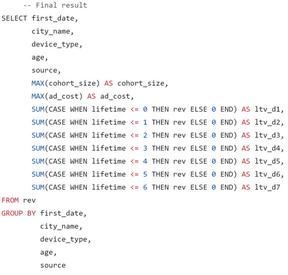
In the final query, we will format the output of the results in the form of a wide table, where we will sum up the LTV by lifetime segments.
Using Tableau Public, I developed a dashboard “Unit Economics Metrics”: Link
Presentation with conclusions and observations:


This project was made with data downloaded as a CSV file from practicum.yandex.ru- Analysis done with SQL
- Dashborad created with TableauThe project can be viewed on my GitHub: This Project
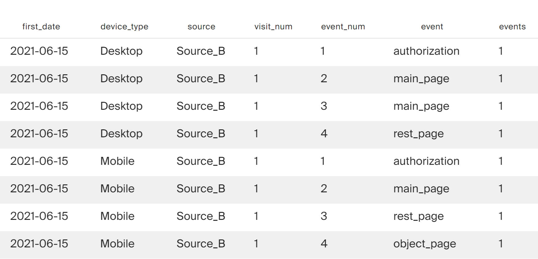
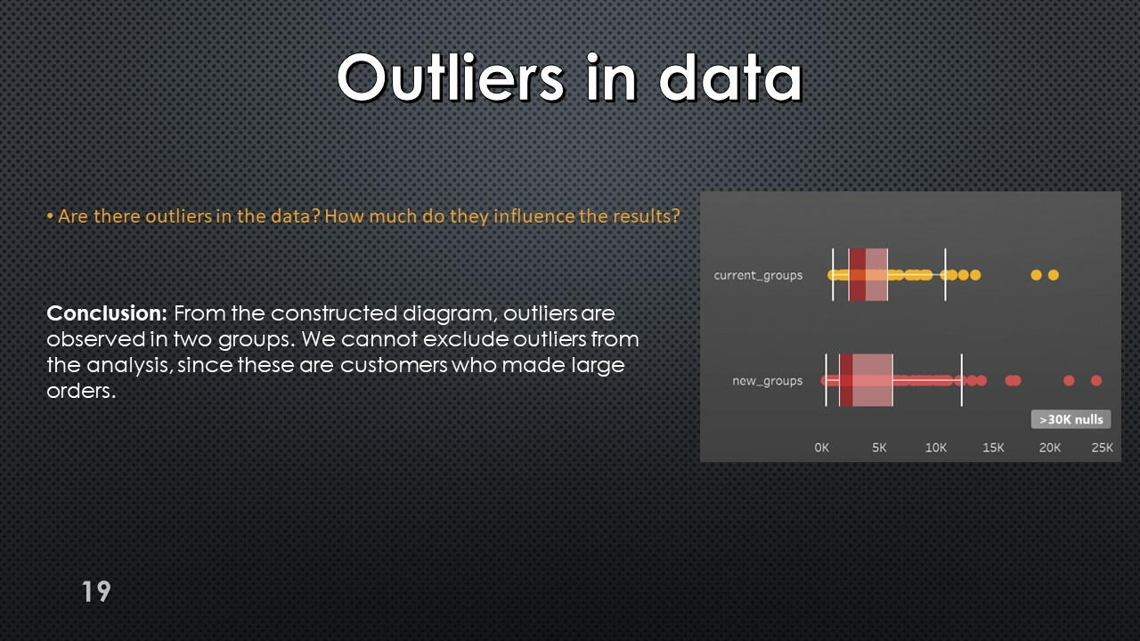
SQL + Tableau | Research of Growth Points for Food Delivery
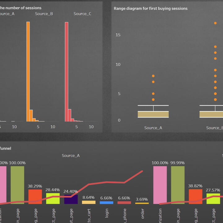
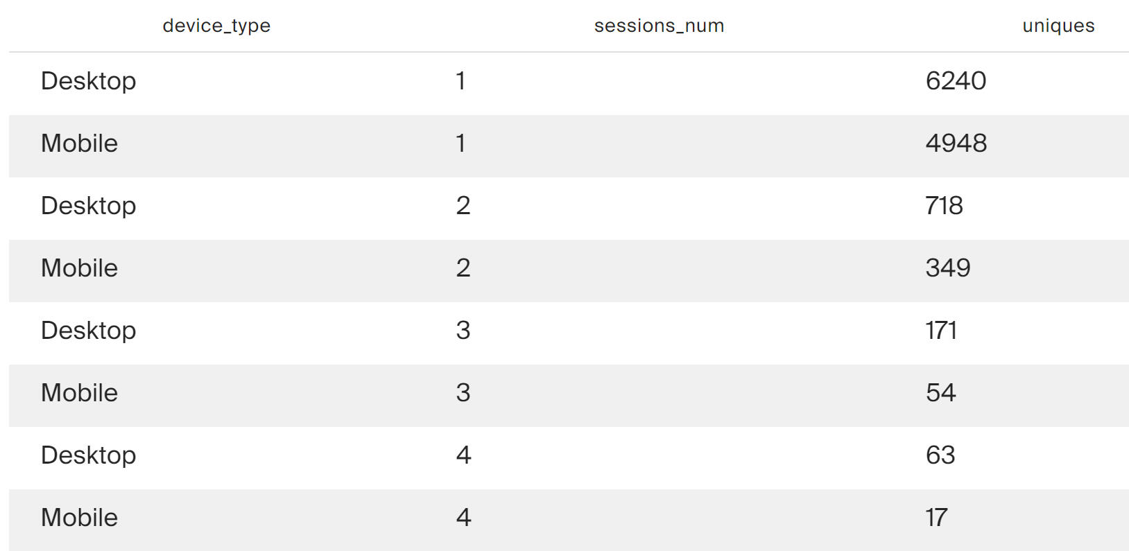
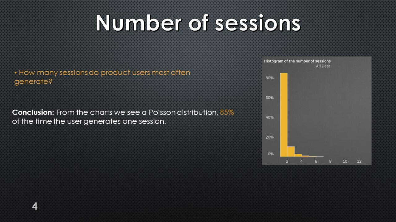
Distribution of the number of user sessions

The query results show that a large proportion of new users do not work within a single session. This is true for this platform.
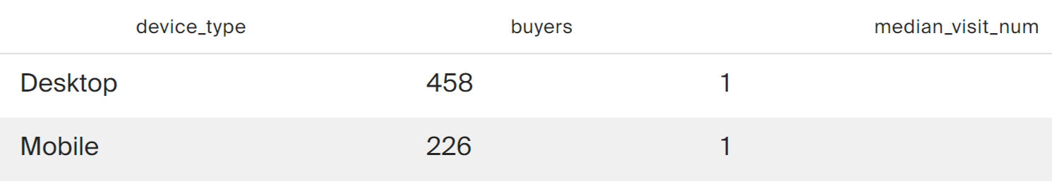
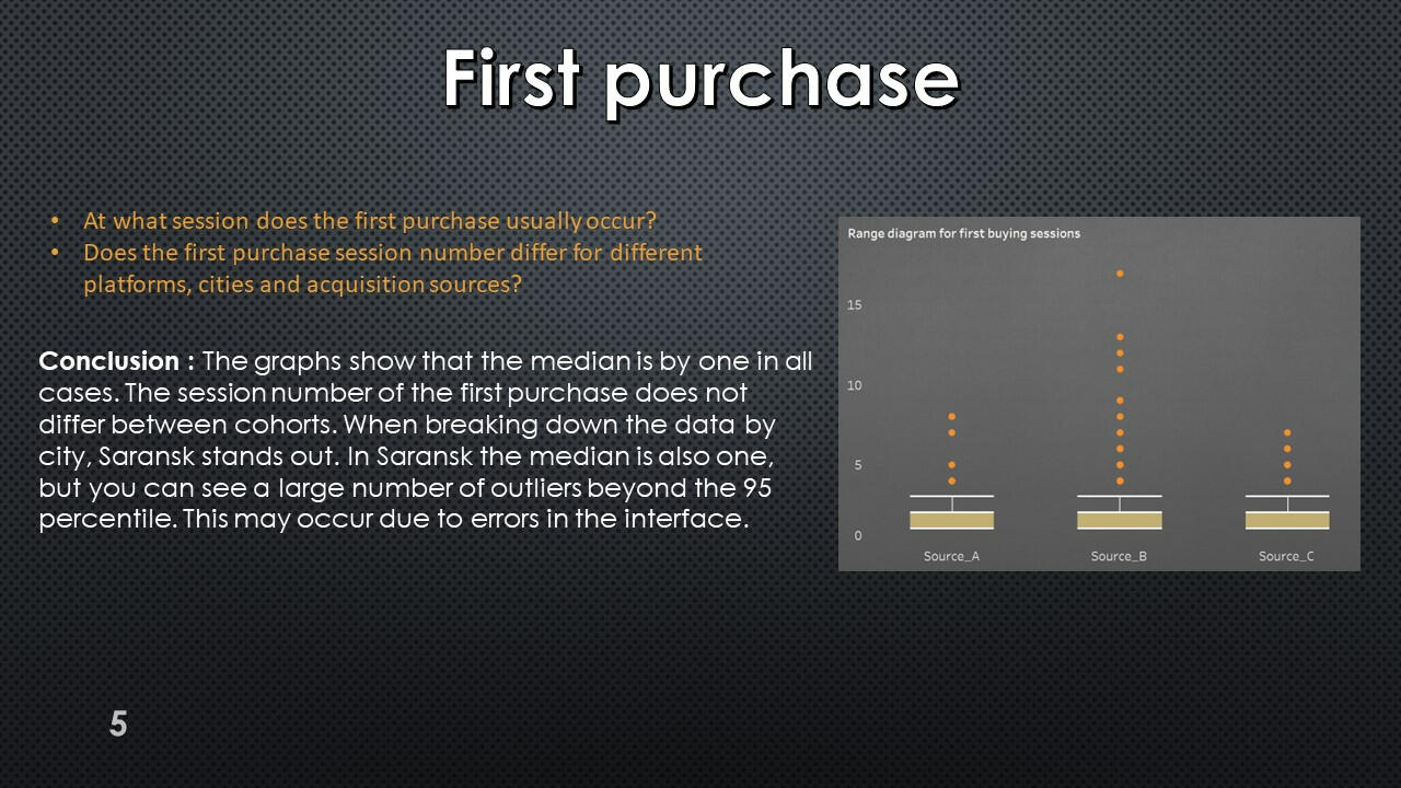
Distribution of first purchases by session numbers

The query results show that on both platforms, purchases most often occur within the first session.
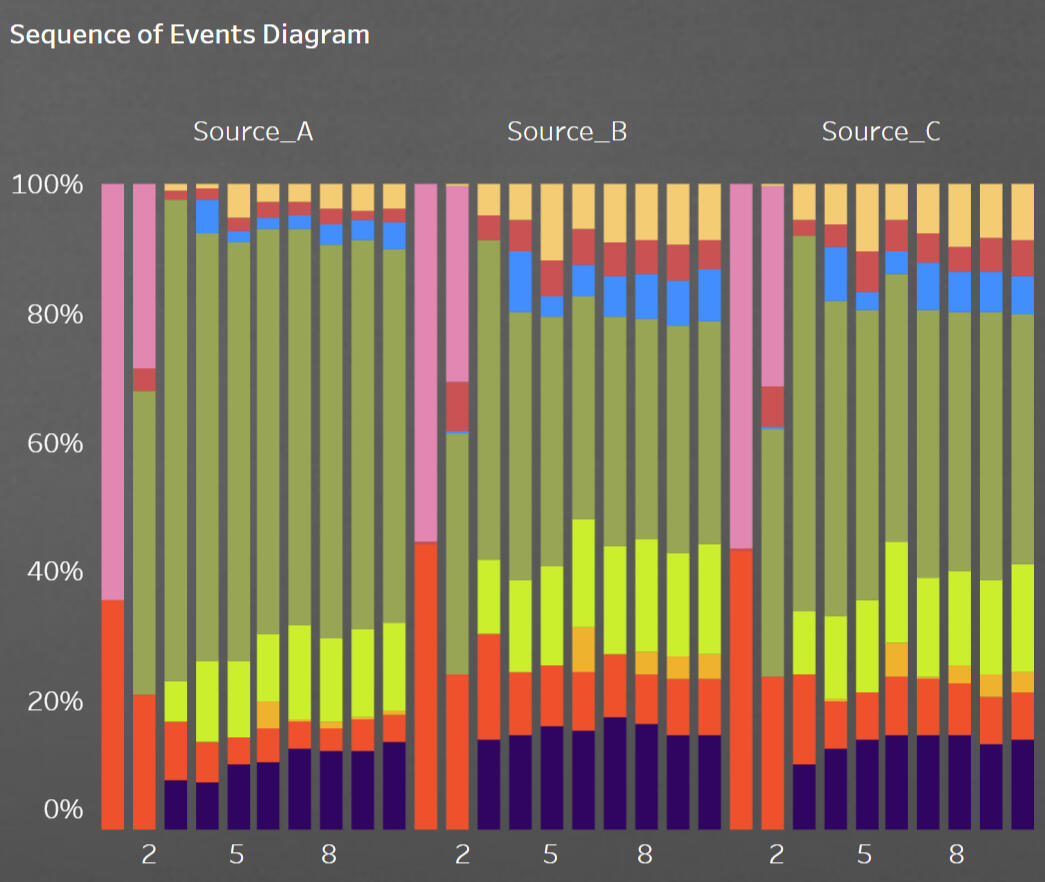
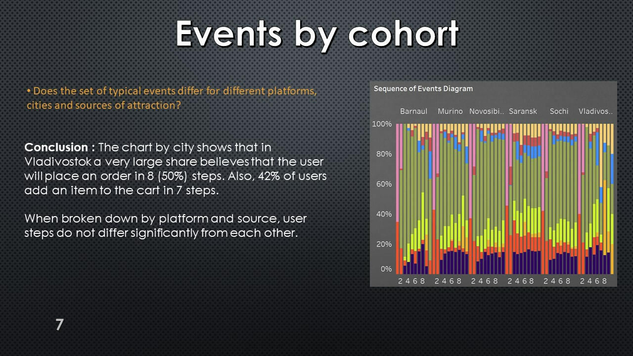
Distribution of first purchases by session numbers

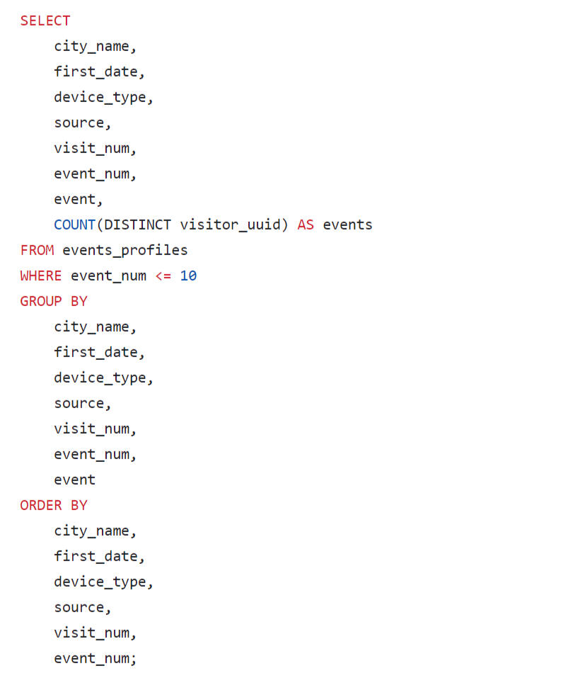
It is difficult to analyze the results of this query using the resulting table; this data is visualized using Tabelau on a diagram: "Sequence of Event Diagram"
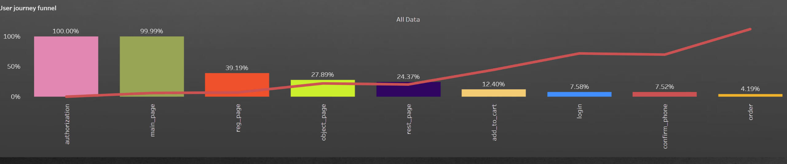
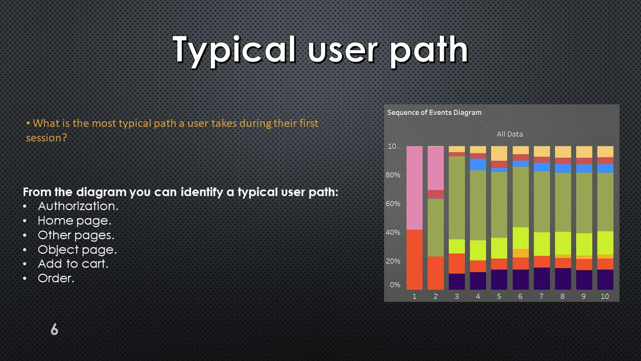
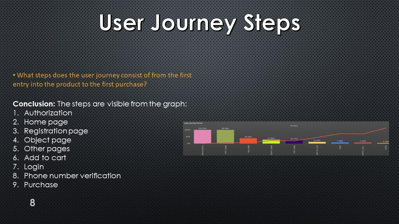
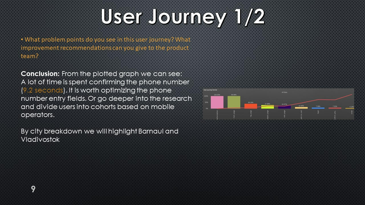
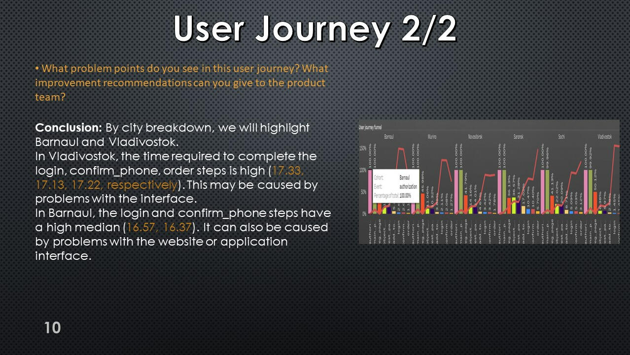
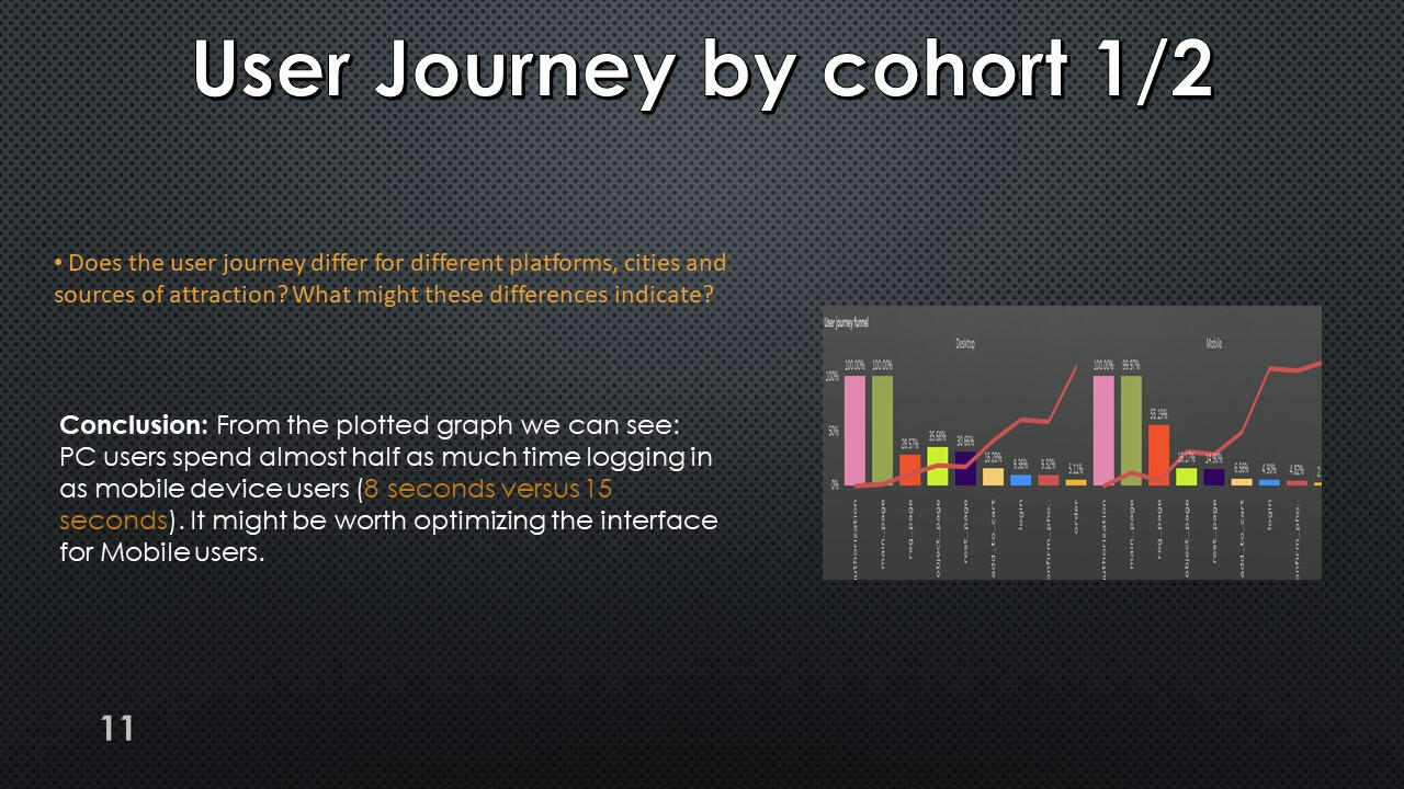
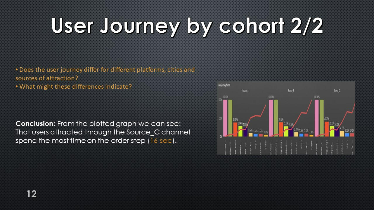
User journey


We also ended up with a very large table, which is better visualized using Tableau.
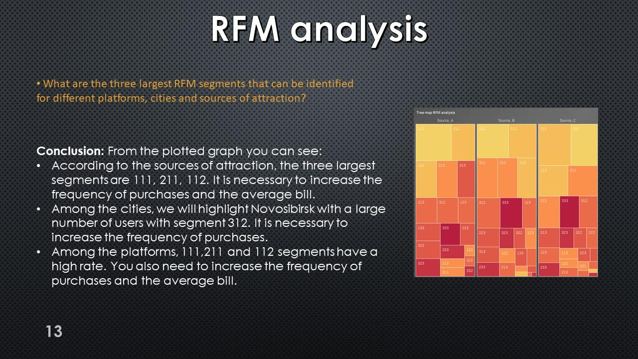
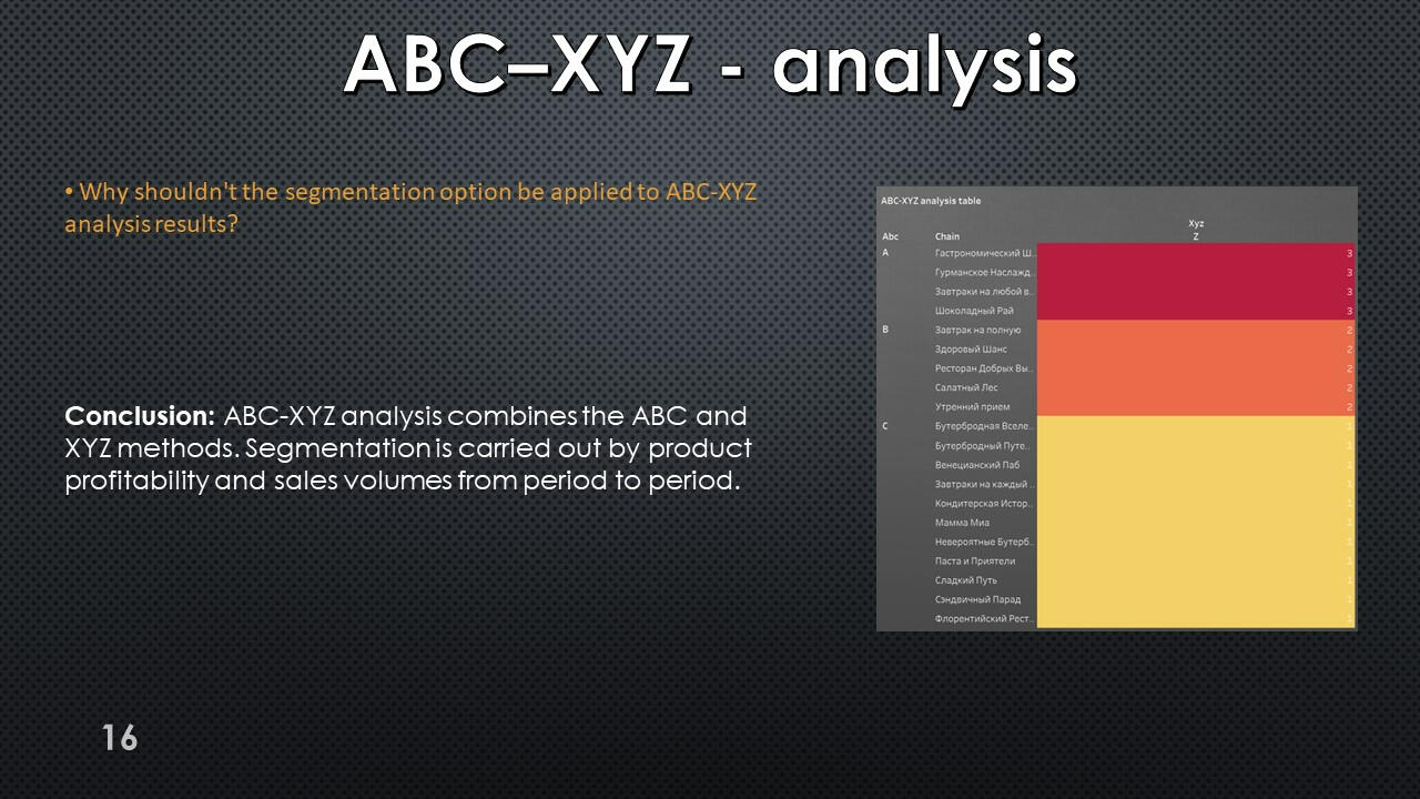
RFM-analysis
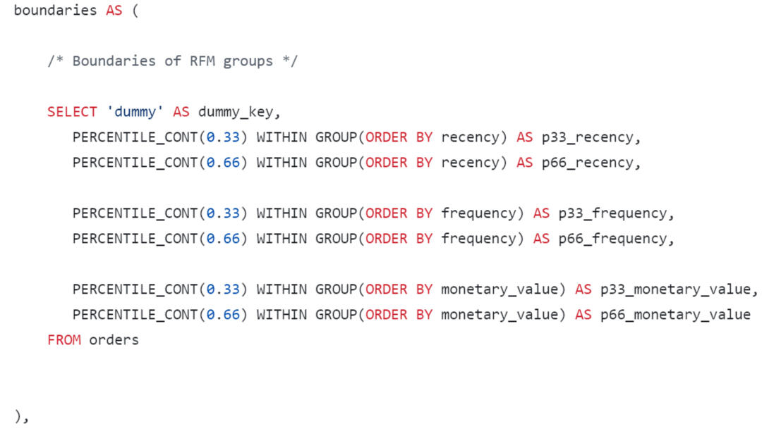


We also ended up with a very large table, which is better visualized RFM-table using Tableau.
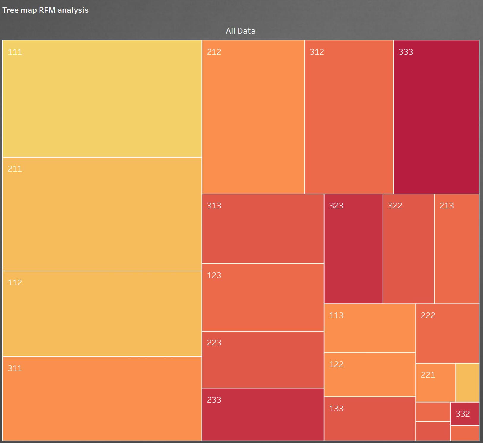
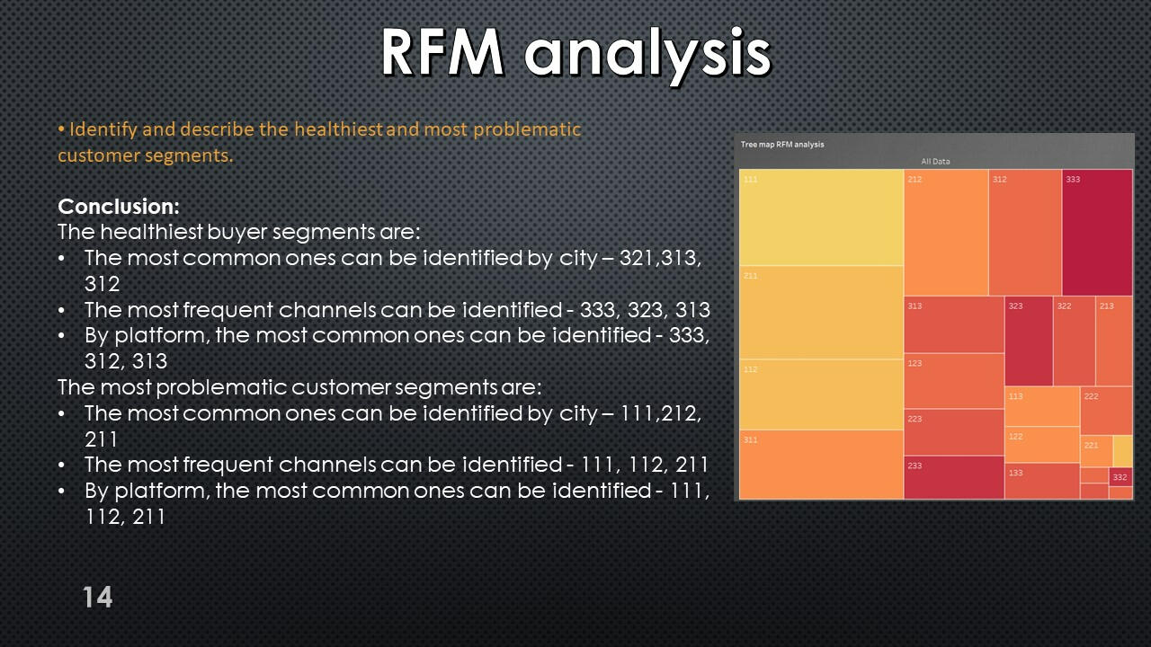
RFM-analysis


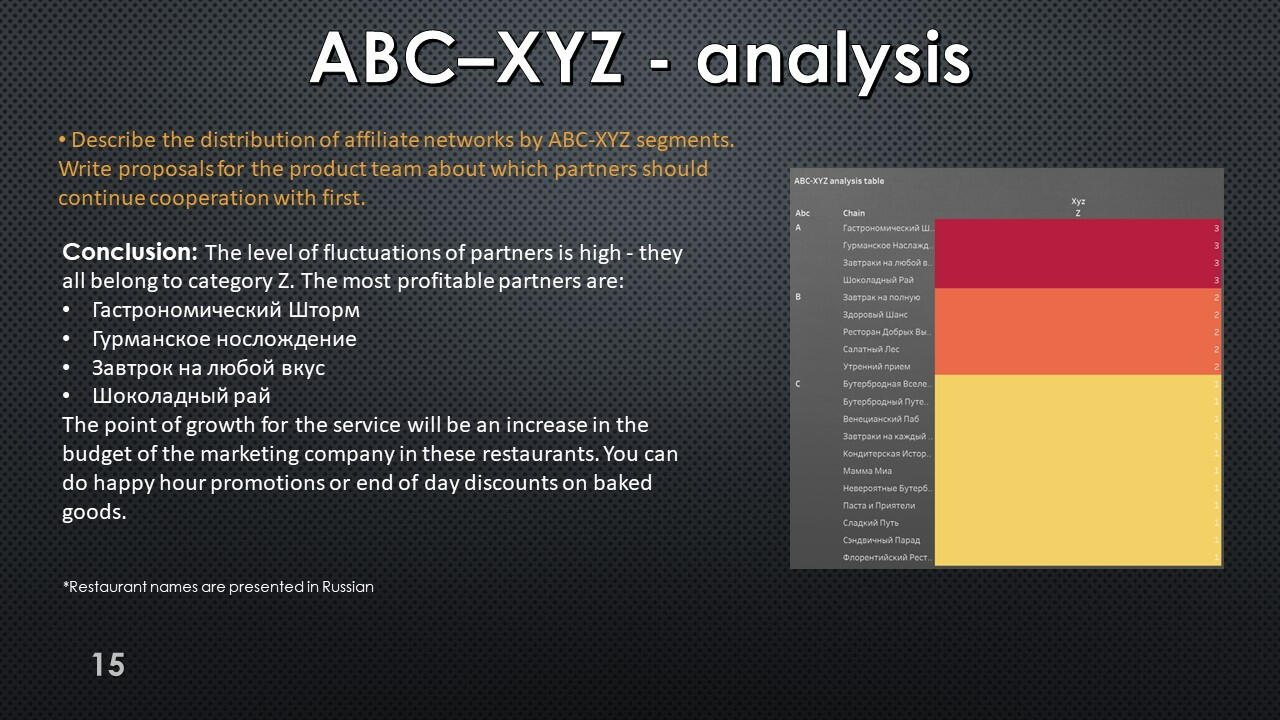
The query results show that segment A includes 4 affiliate networks, but all partners have extremely unstable demand and belong to category Z.
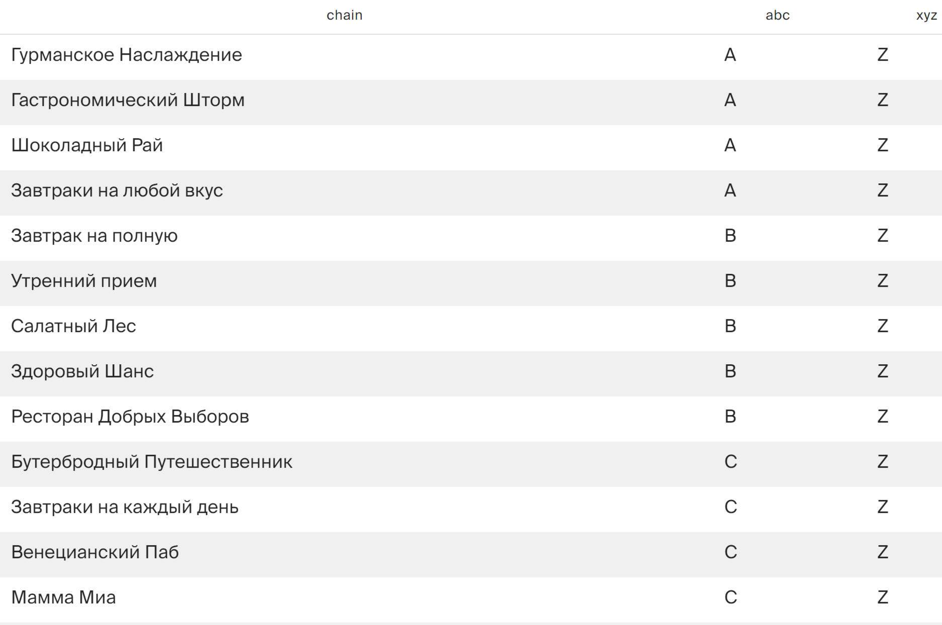
*Restaurant names are presented in Russian
Using Tableau Public, I developed a dashboard “Research of Growth Points": Link
Presentation with conclusions and observations:


This project was made with data downloaded as a CSV file from practicum.yandex.ru- Analysis done with SQL
- Dashborad created with TableauThe project can be viewed on my GitHub: This Project
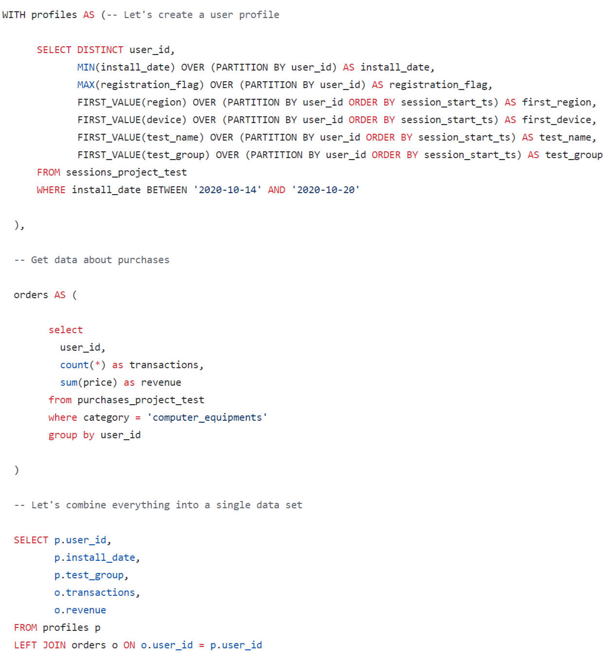
SQL + Tableau | Preparation and analysis
of the A/B test
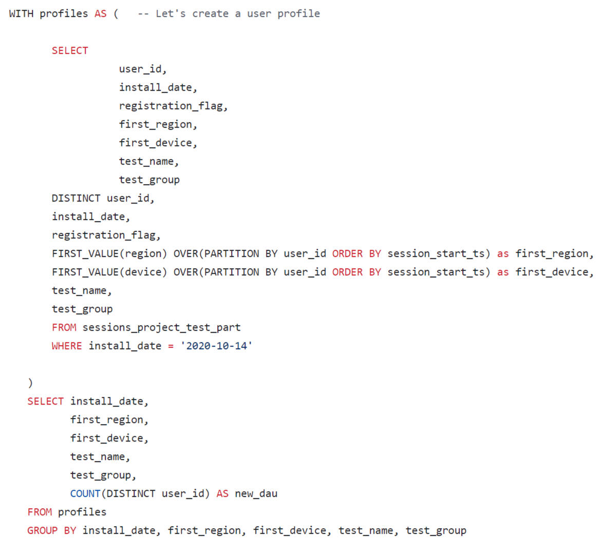
Test preparation: data acquisition
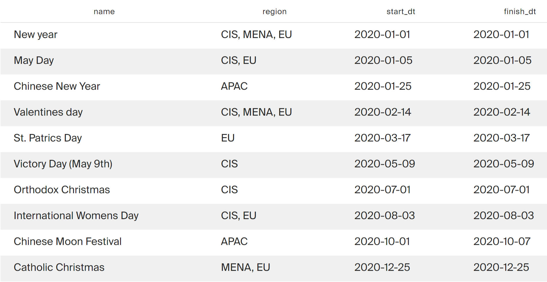
List of marketing activities:

Data on international holidays will be needed to choose when to run the test between marketing activities.
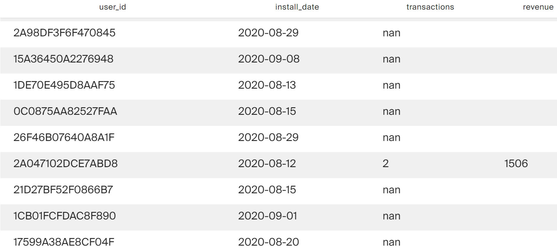
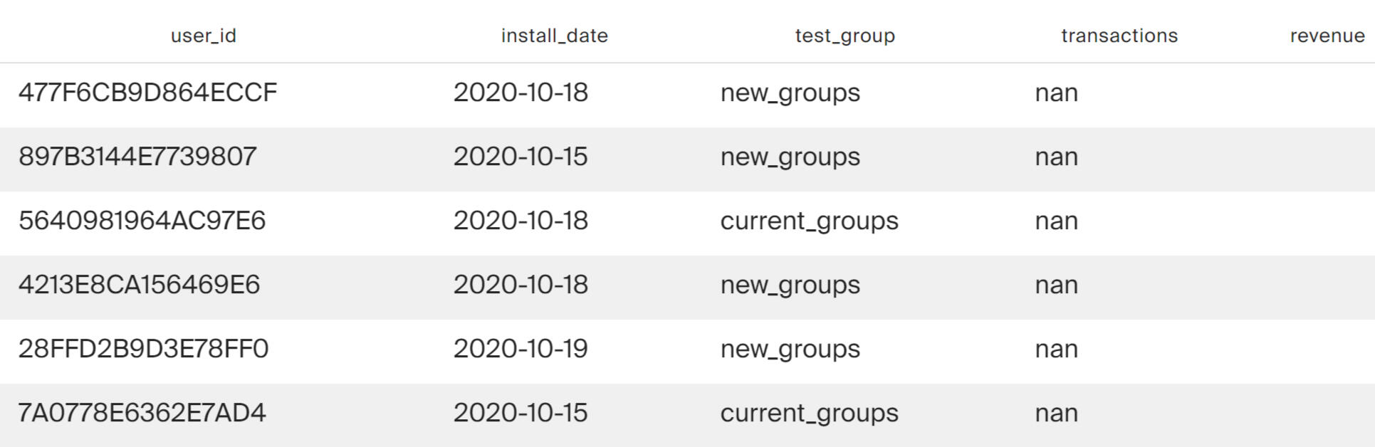
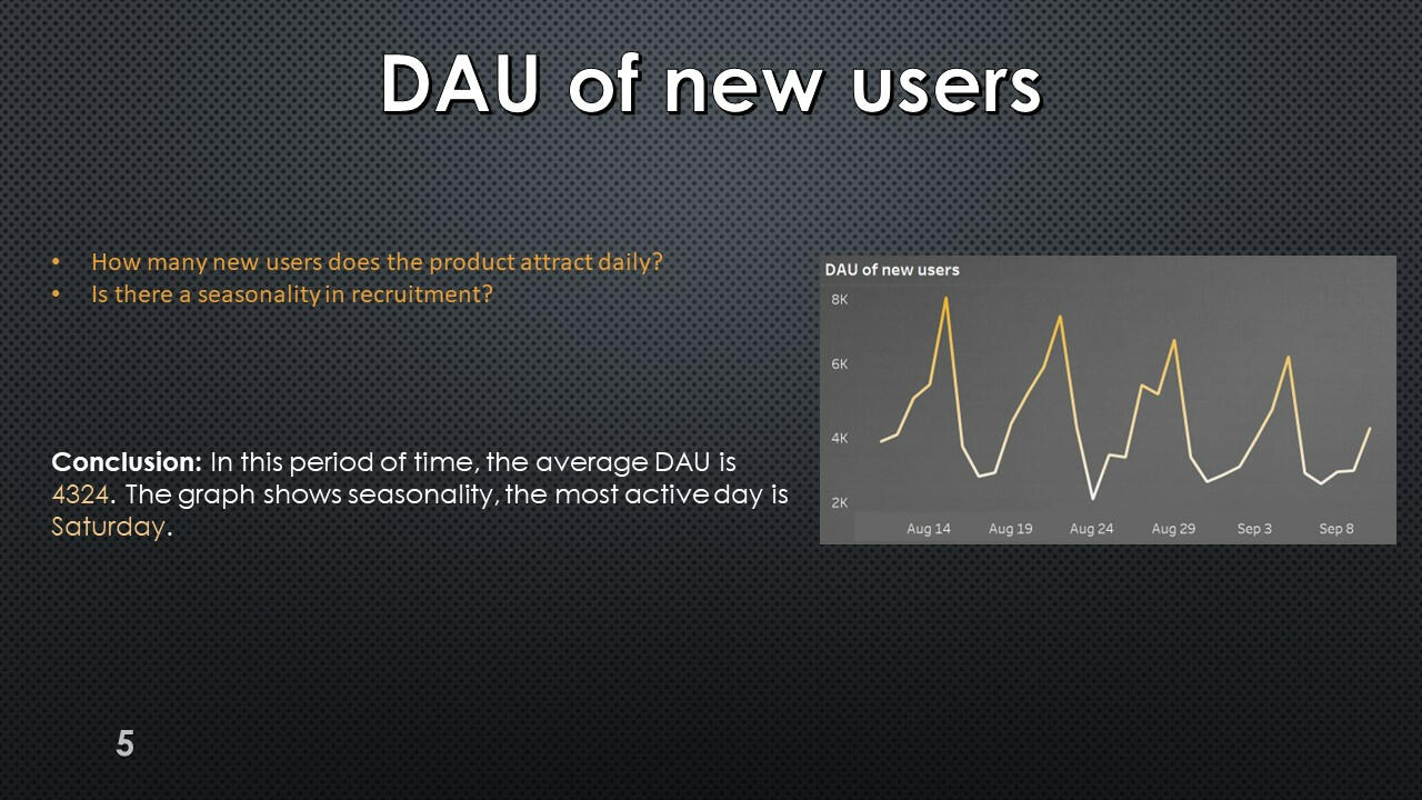
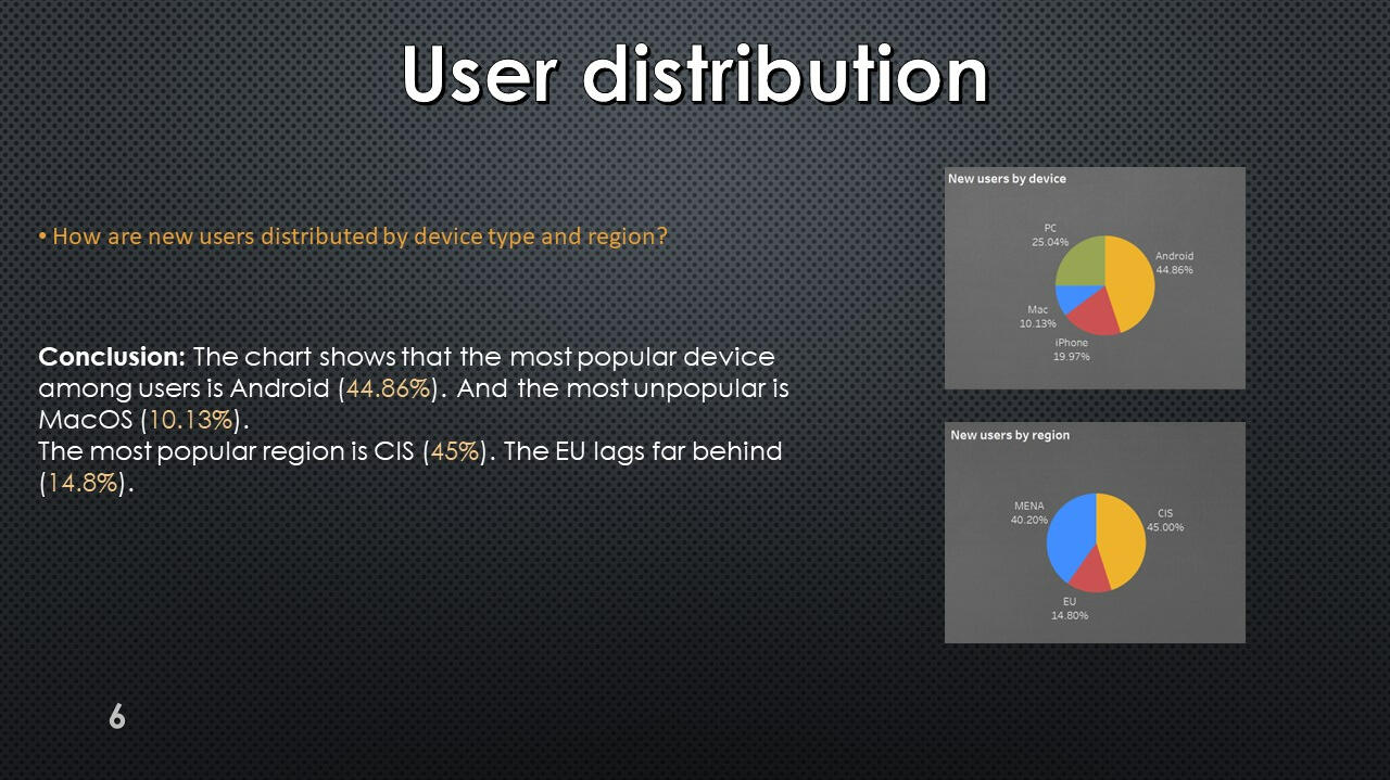
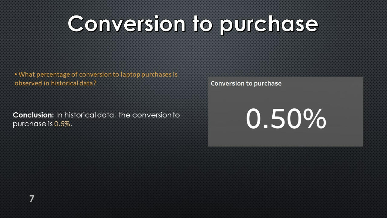
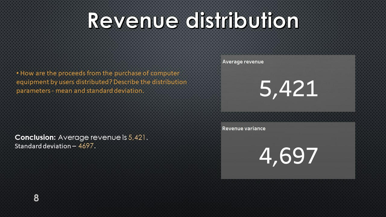
Conversion and revenue
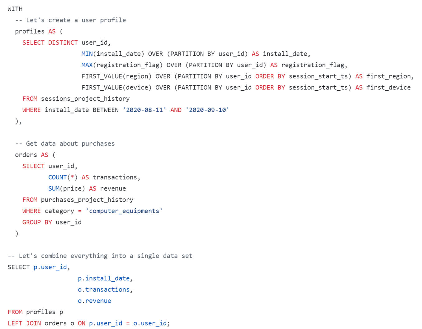
Created a table of user profiles. For each profile, the number of transactions in the “Computer Equipment” category (computer_equipments) and the total expenses in this category (store revenue for purchases made by the user) were calculated.
Now we have enough data to build a dashboard, calculate the duration of the test and select the moment to launch it.
Using Tableau Public, I developed a dashboard “Historical Data Analysis": Link
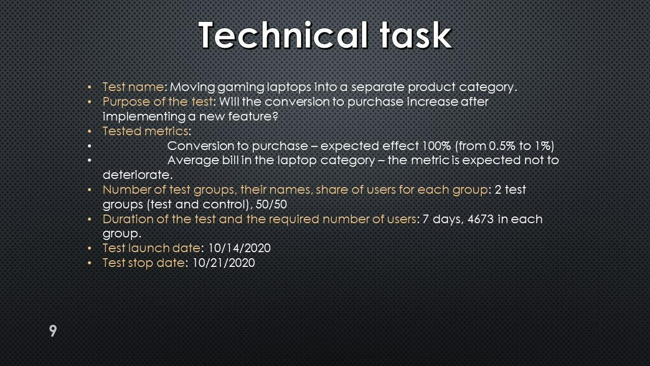
Technical task
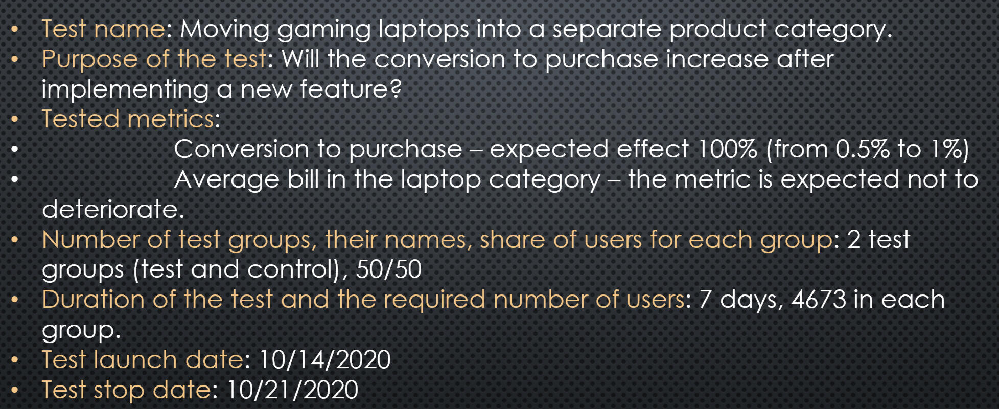
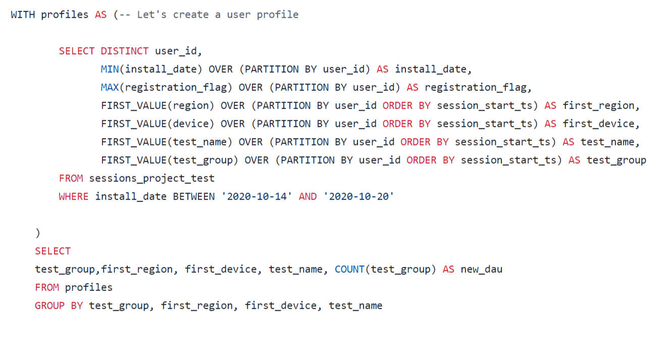
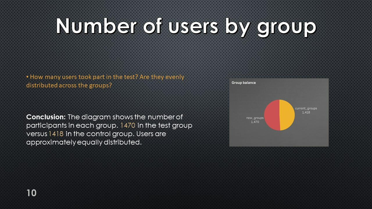
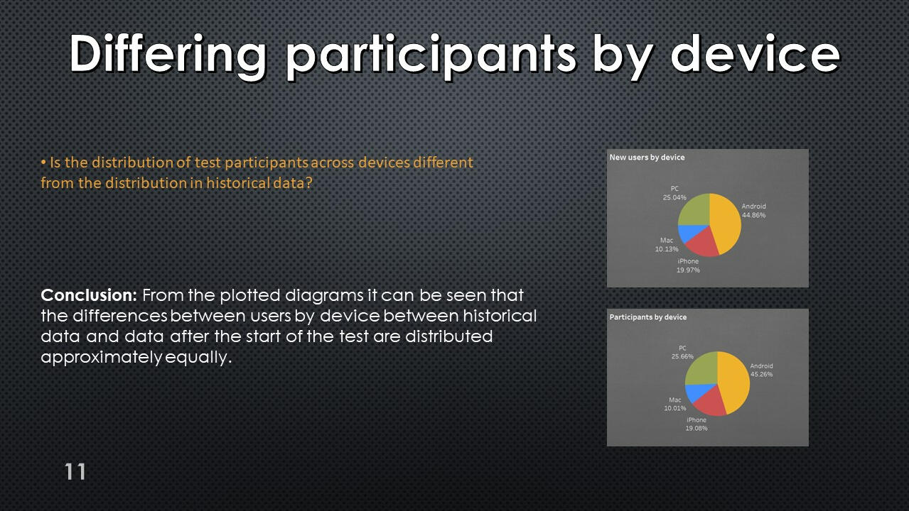
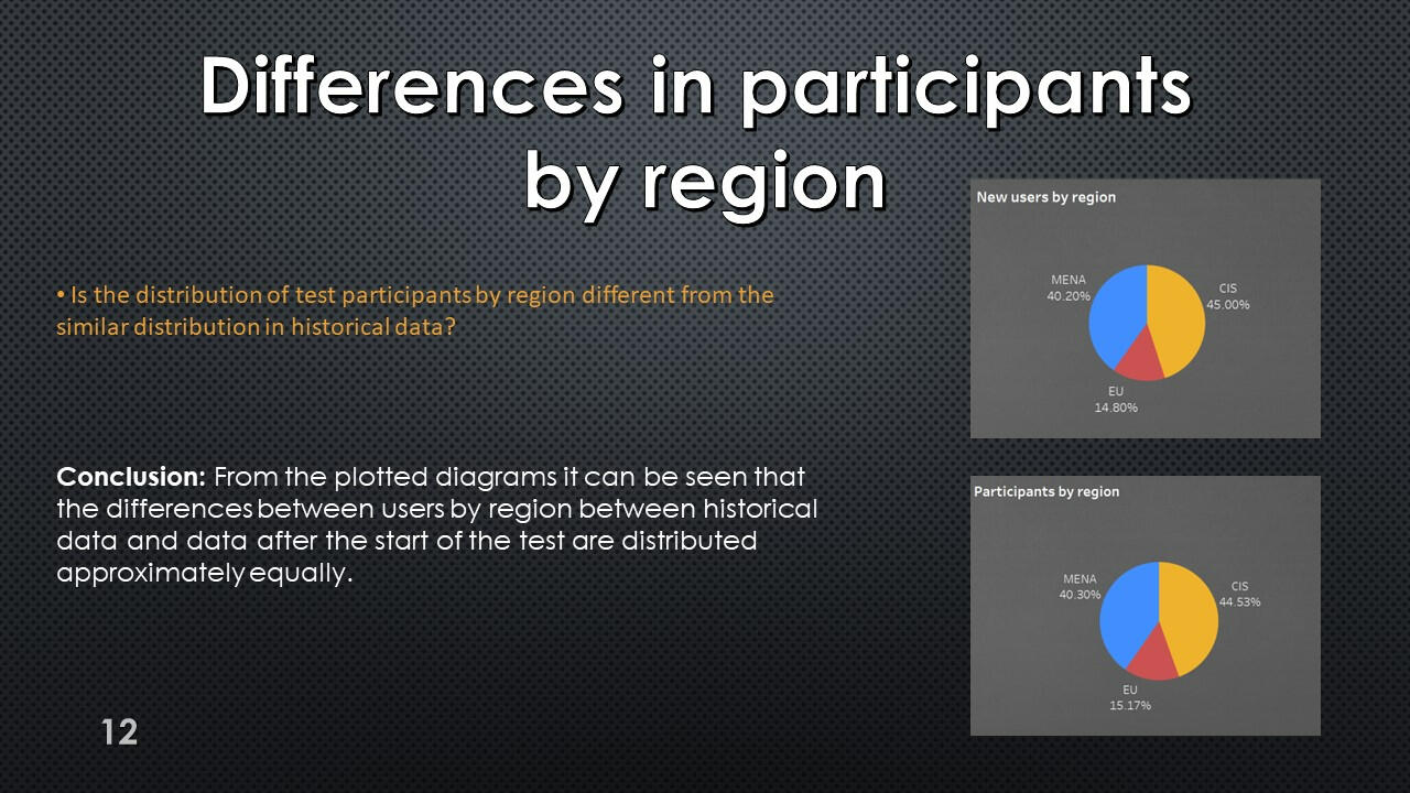
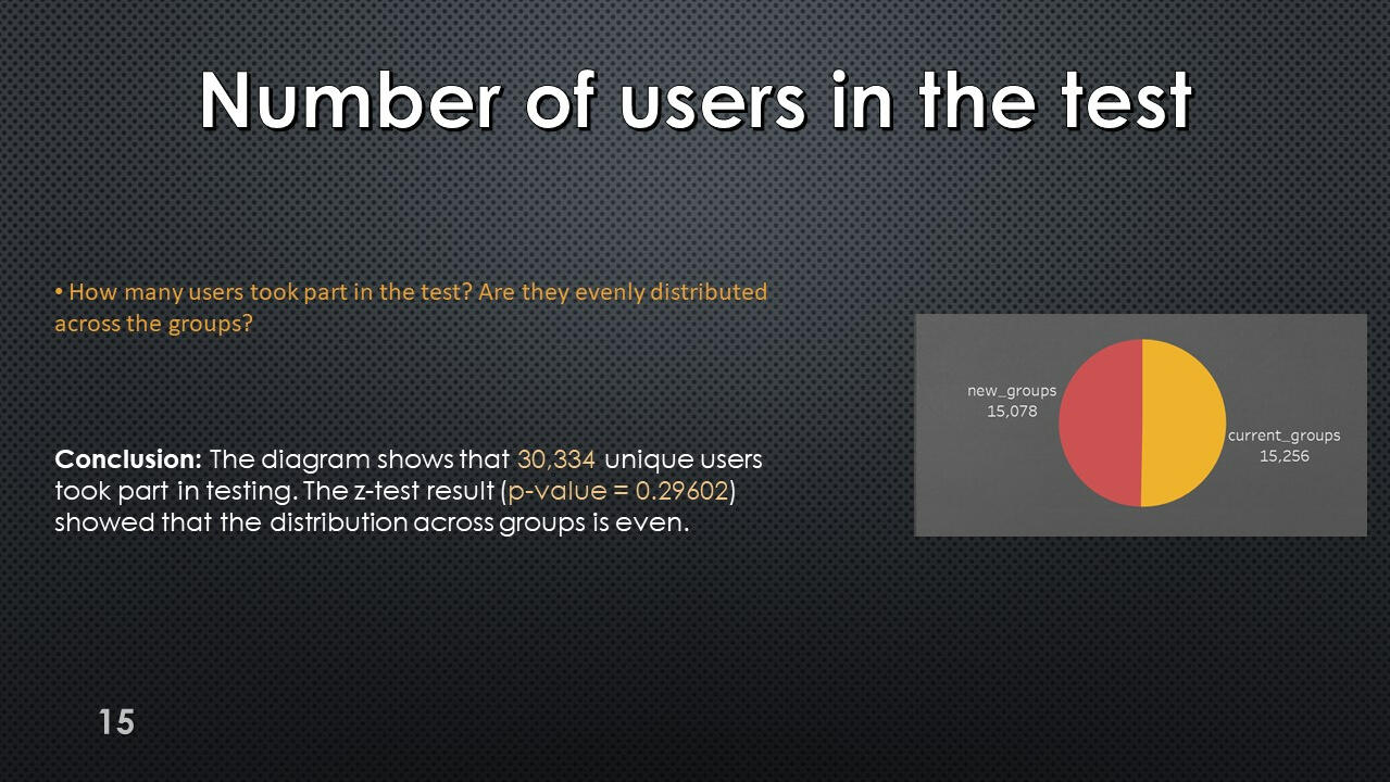
Table of distribution of test participants by days of recruitment, groups, devices and geographic regions.
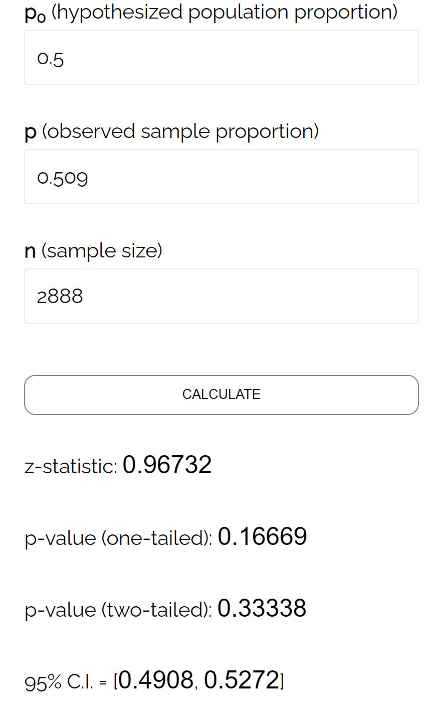
Using this data, we can run a z-test on the proportions to check whether the experiment was performed correctly.
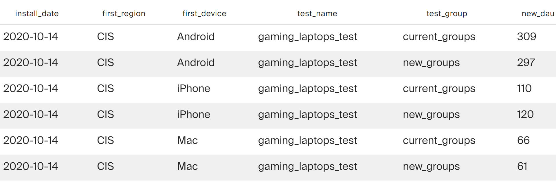
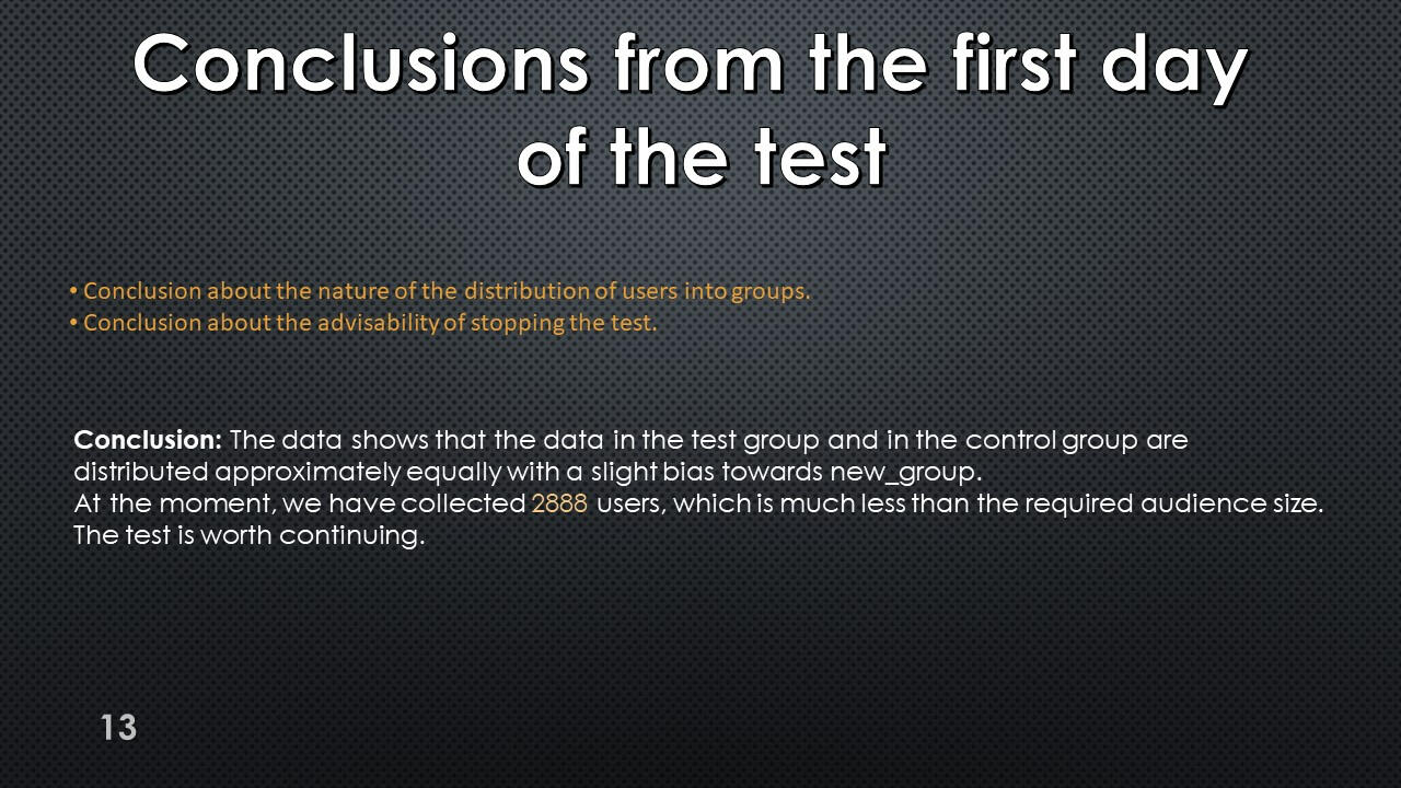
The null hypothesis is not rejected; test participants are distributed evenly across groups.
Users included in more than one test group
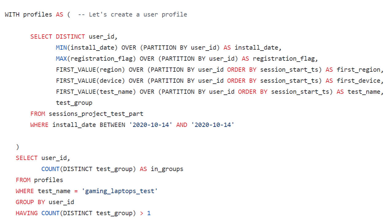
The result is an empty data set. There were no participants in the test who were in both test groups.
Conclusions from the first day
of the test

Using Tableau Public, I developed a dashboard “Analysis of the data after the start of the test": Link
Table of distribution of test participants by test group, geographic region and device type.
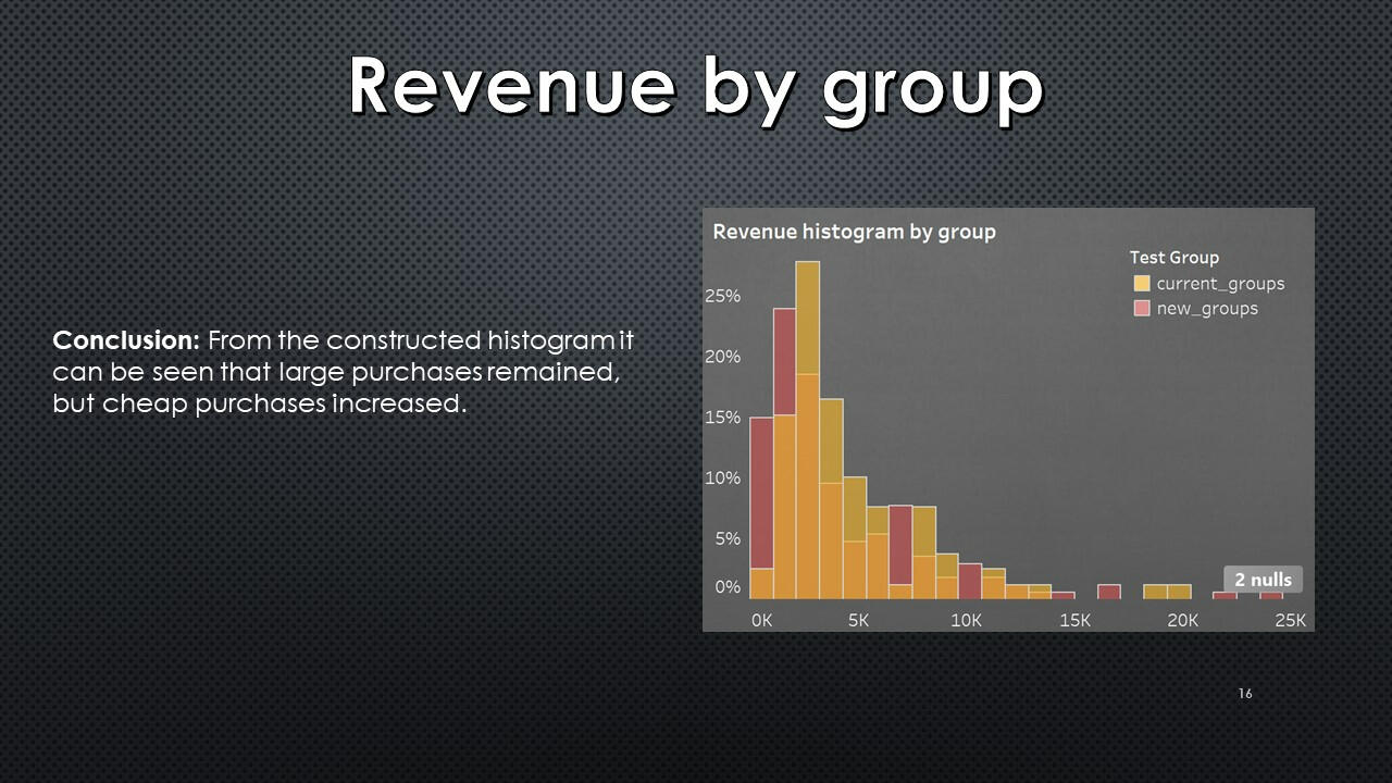
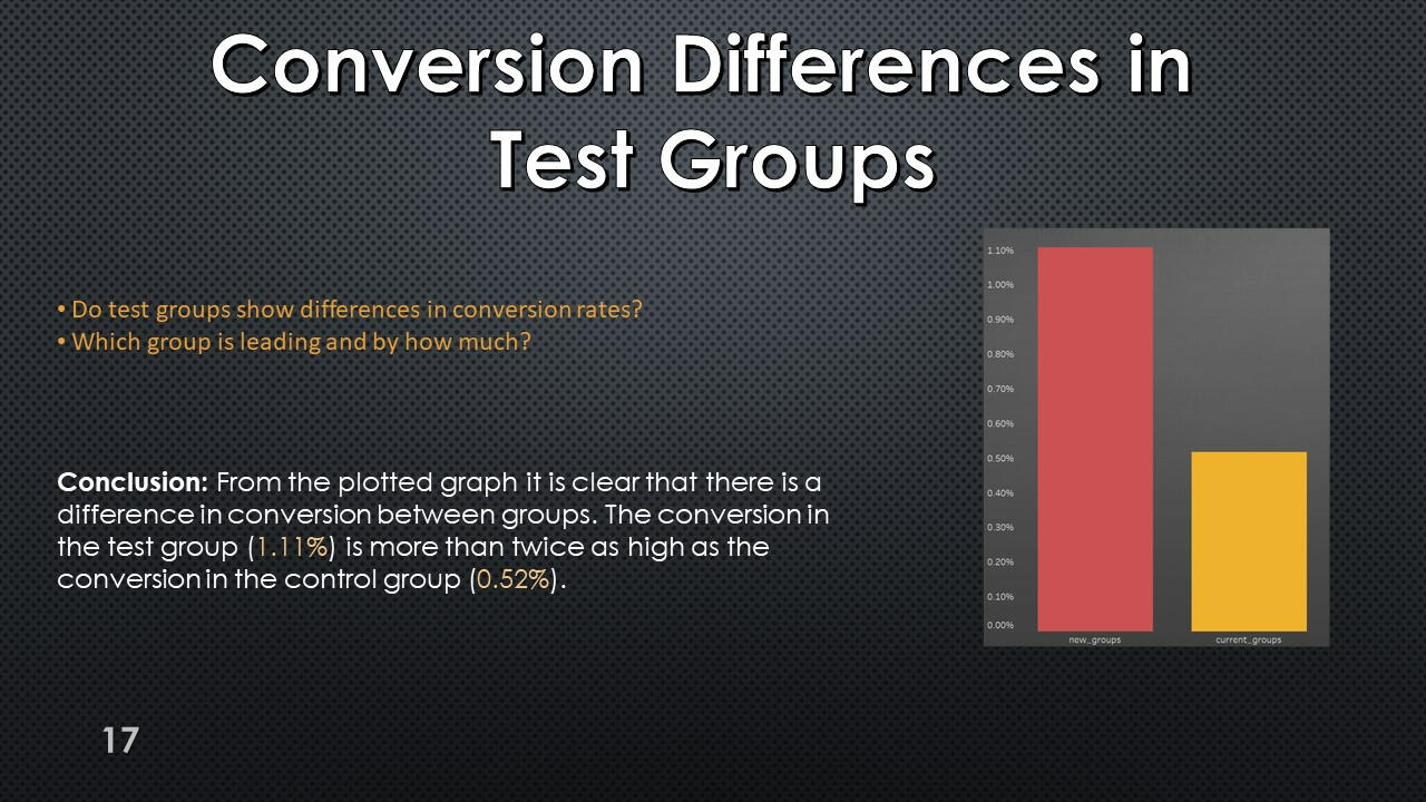
Conversion and revenue
Test results table. For each user, his test group, the number of transactions in the computer equipment category (computer_equipments) and total expenses in this category (store revenue for purchases made by the user in the computer equipment category) were found.
Using Tableau Public, I developed a dashboard “Analysis of the A/B testing results": Link
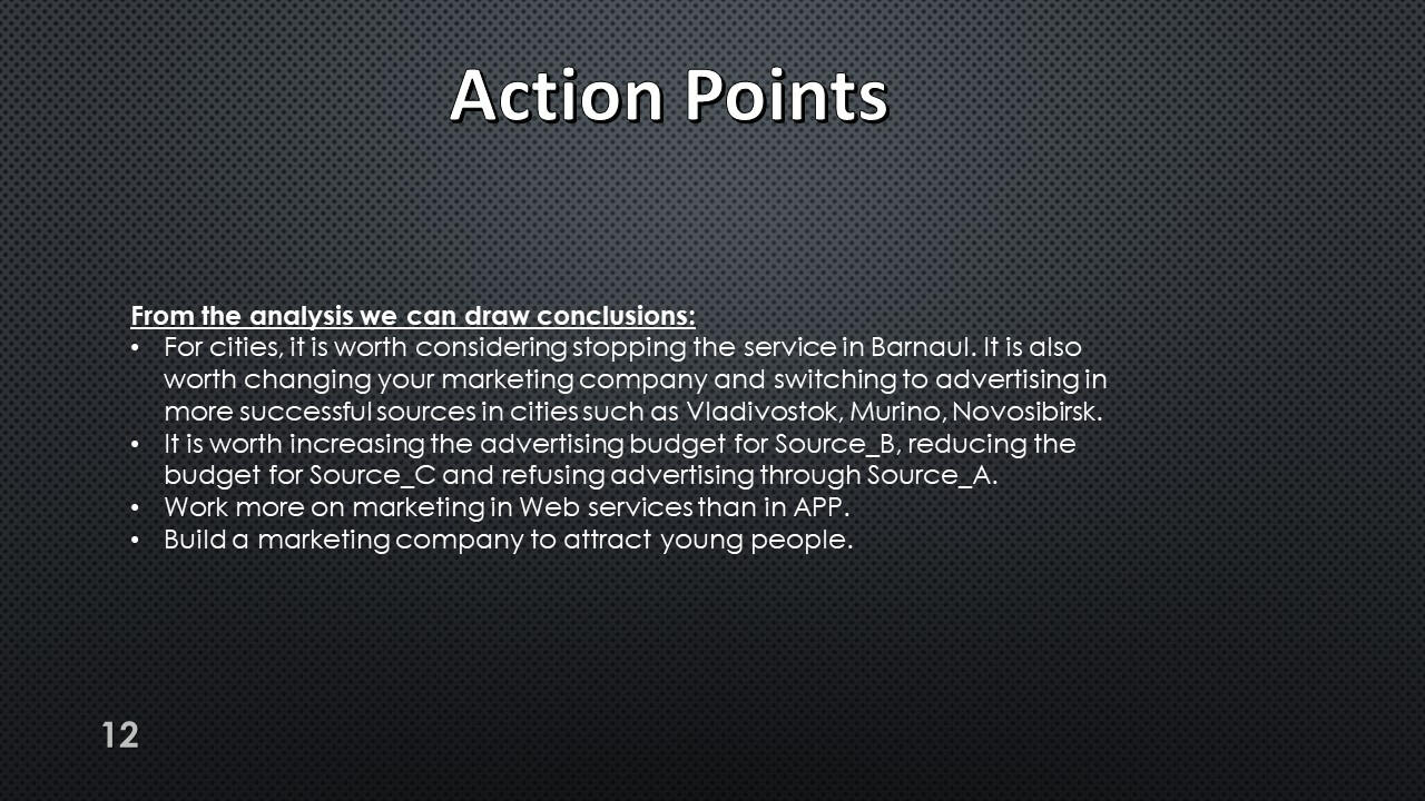
Action Points:
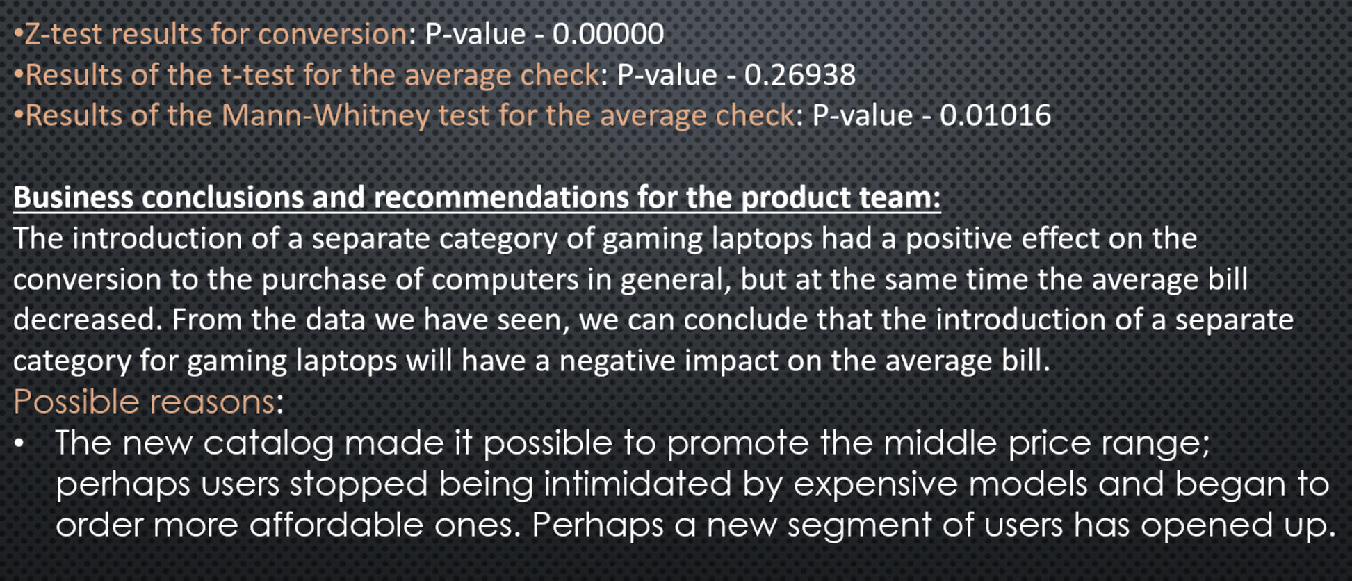
Presentation with conclusions and observations:


This project was made with data downloaded as a CSV file from practicum.yandex.ru- Analysis done with SQL
- Dashborad created with TableauThe project can be viewed on my GitHub: This Project
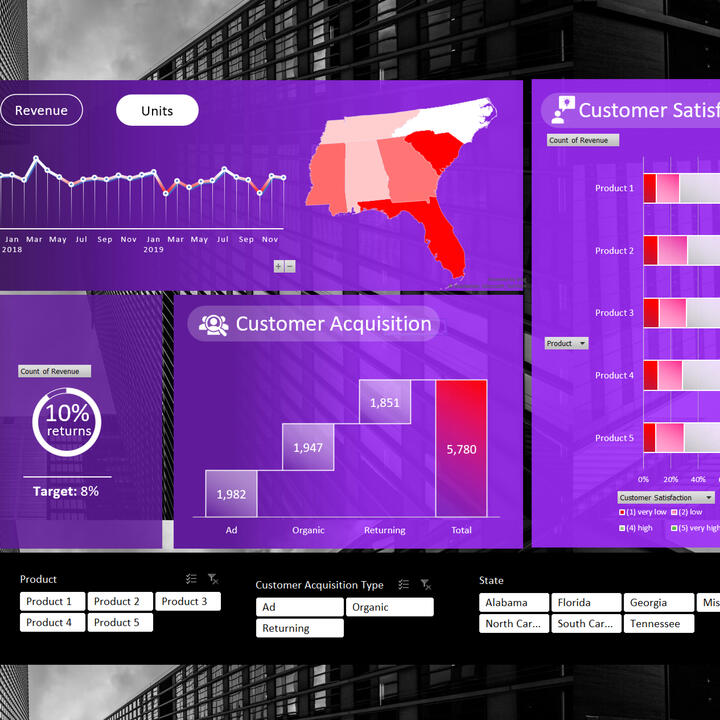
Excel | Sales Company Data
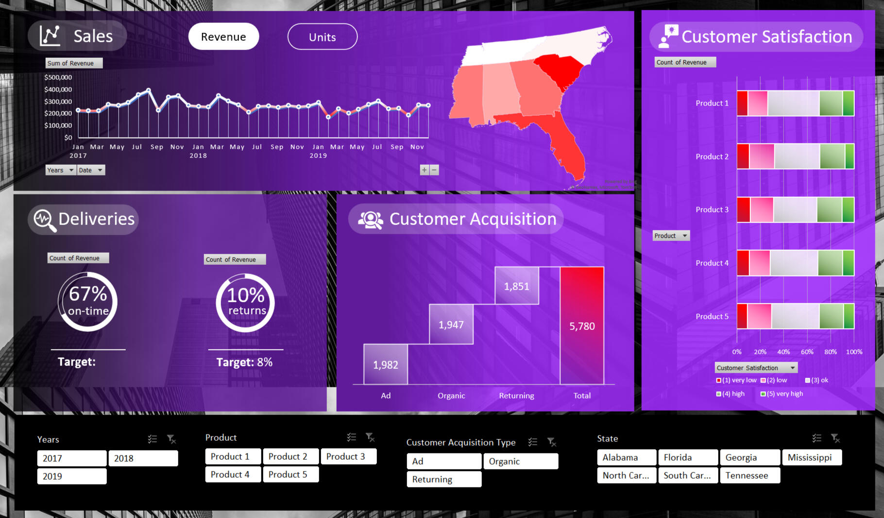
In this project, I explore sales data in seven US states.
I research the data in four areas the sale, the delivery of goods, the satisfaction of our customers, and customer acquisition.
Data from 2017 to 2019.Here are some key insights:
- The company needs to improve punctuality in delivery and reduce the percentage of returned goods.
- Sales in 2019 are lower than in 2017.
- Product 1 is most popular product among customers its sales are significantly higher than the restt.
- Advertising works best to attract new customers.
- About 25% of customers are unhappy with our products.I used the following skills to manipulate the data and create the dashboard:
- Slicers
- SUMIFs
- Charting
- Formatting
- Pivot Tables
- Data manipulation
- Aggregate Functions
The full project can be viewed on my Google Drive: This and Other Project
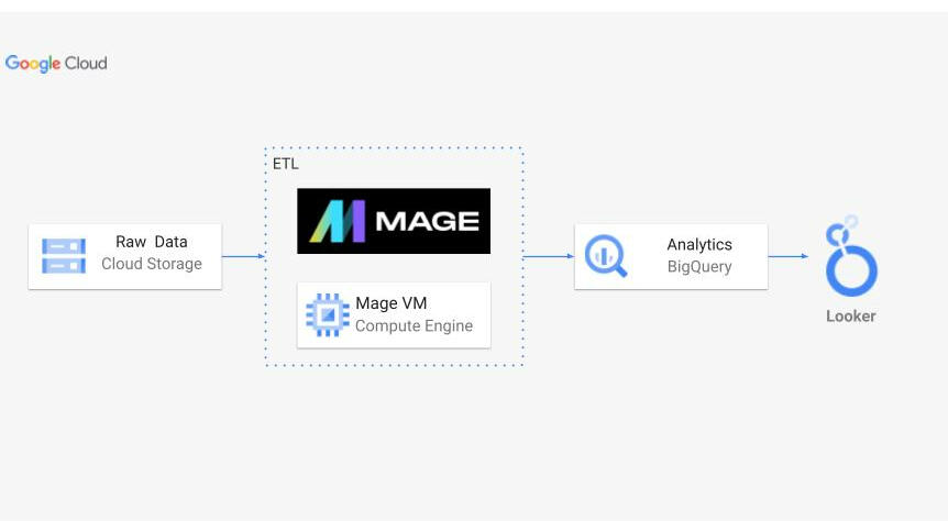
Python | Uber ETL project
Architecture:
Summary:
In this project, I conducted Extract, Transform, Load (ETL) processes on Uber New York data to derive meaningful insights. Initially, I retrieved the raw data from its source, followed by uploading it into Google Cloud Storage for efficient management. Leveraging a Mage VM Compute Engine, I constructed a robust ETL pipeline. This pipeline facilitated the seamless transfer of data into BigQuery for analysis. Subsequently, utilizing Looker Studio, I visualized the analyzed data, unveiling valuable insights and trends.
Dataset:
Data extracted from: nyc.gov
ETL Pipline:
Mage VM Compute Engine played a pivotal role in this project, offering a scalable computing environment essential for processing large volumes of data efficiently. Through Mage, I orchestrated the execution of Python scripts responsible for the extraction, transformation, and loading stages of the ETL pipeline. This allowed for seamless integration with Google Cloud services, ensuring optimal performance throughout the data engineering process.
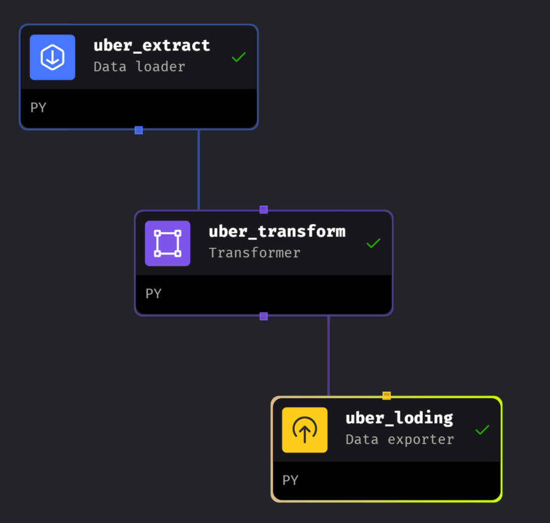
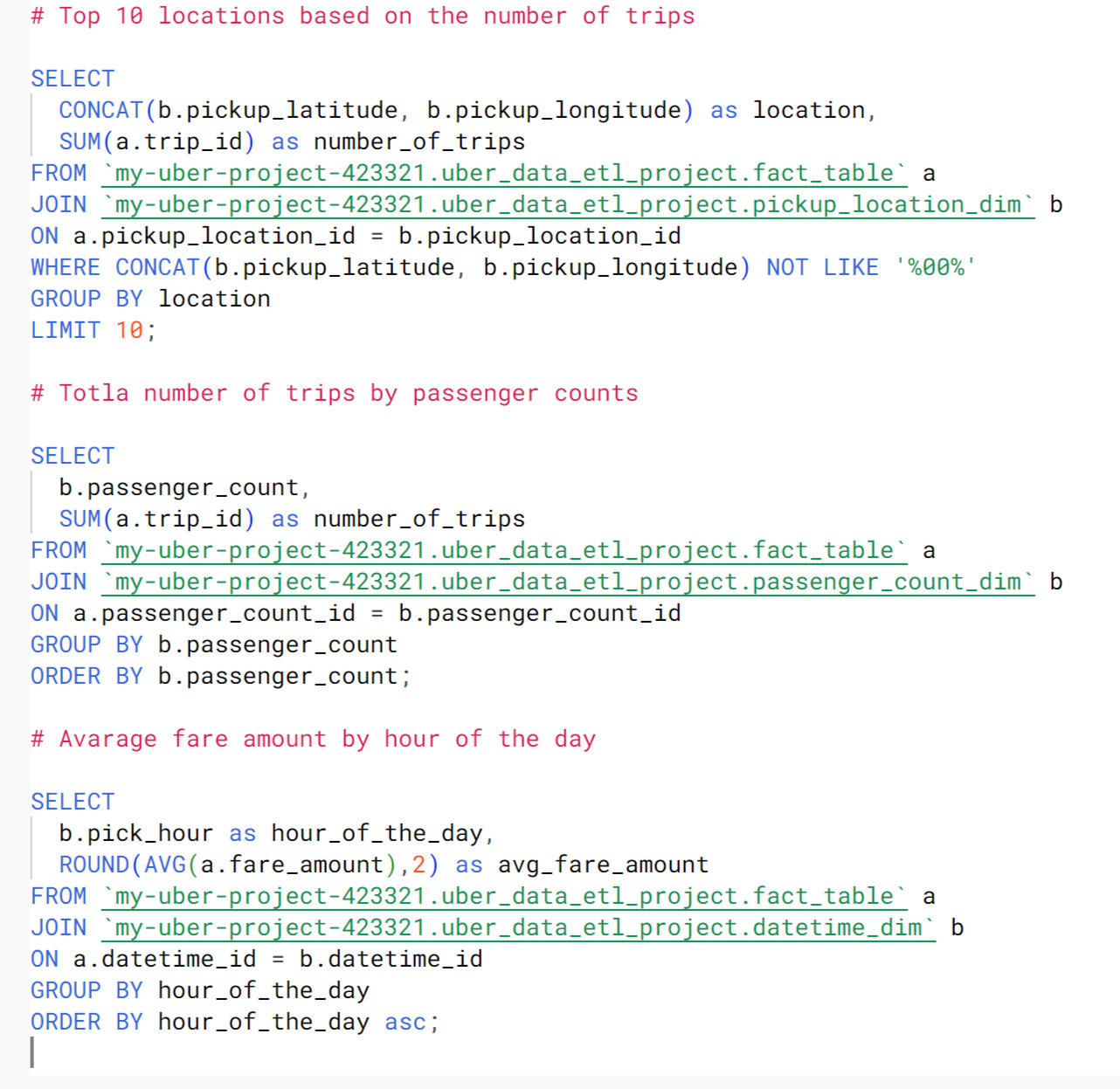
Extract, Transform and Load Code:
Extract:
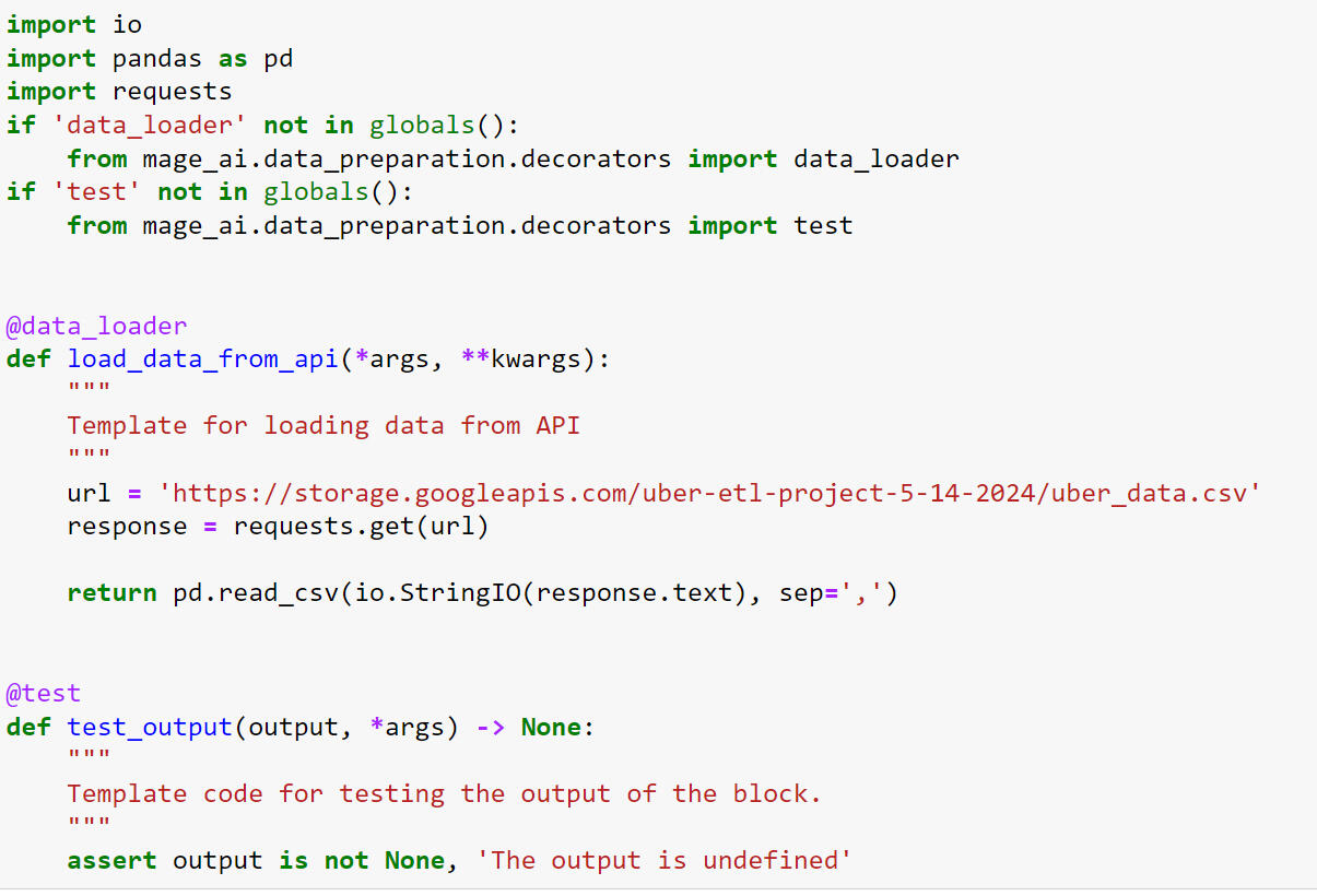
This Python script fetches Uber New York data from an API URL and converts it into a Pandas DataFrame. It's optimized for integration into an ETL pipeline, ensuring smooth data loading. A built-in test function validates output reliability.
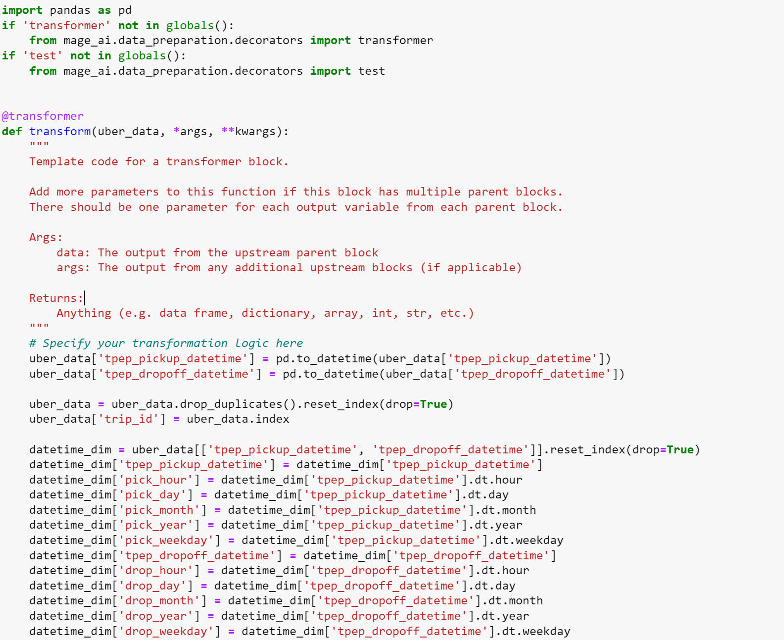
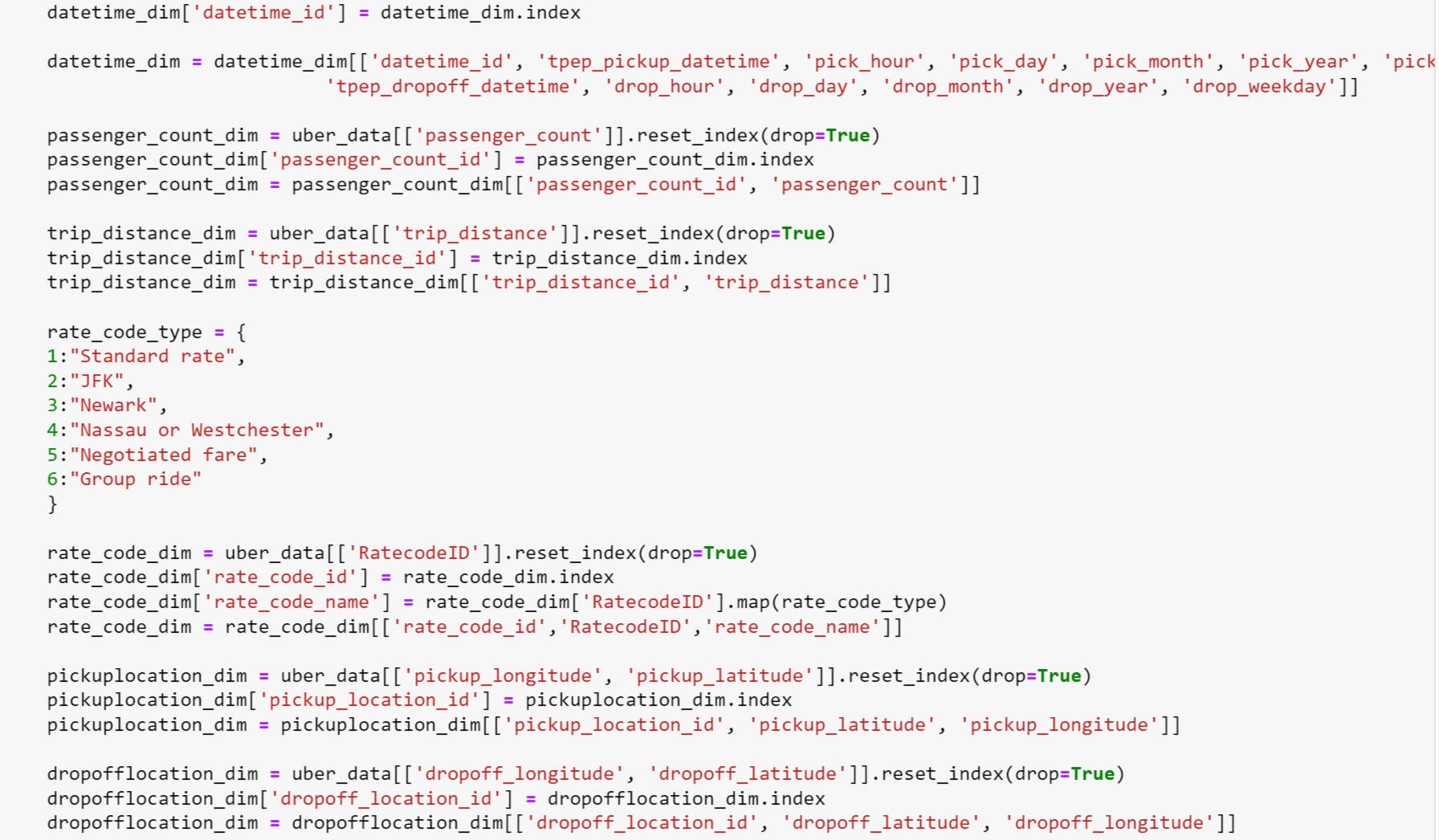
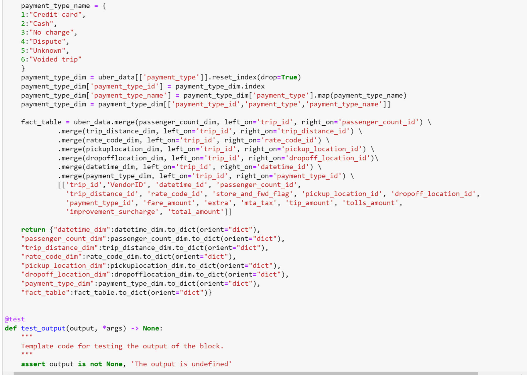
Transform:
This Python script performs transformations on Uber New York data, preparing it for analysis and loading into a data warehouse. It standardizes datetime fields, generates dimension tables for various attributes, and constructs a fact table for analytical queries. The script's output adheres to a structured format conducive to downstream processing in an ETL pipeline.
Load:
This Python script facilitates the seamless loading of transformed Uber New York data into BigQuery, a cloud-based data warehouse. Leveraging Mage AI's BigQuery module, it exports dataframes to specified tables within the warehouse. The script's configuration settings are managed through an 'io_config.yaml' file, ensuring flexibility and scalability in data loading operations.
BigQuery Analysis:
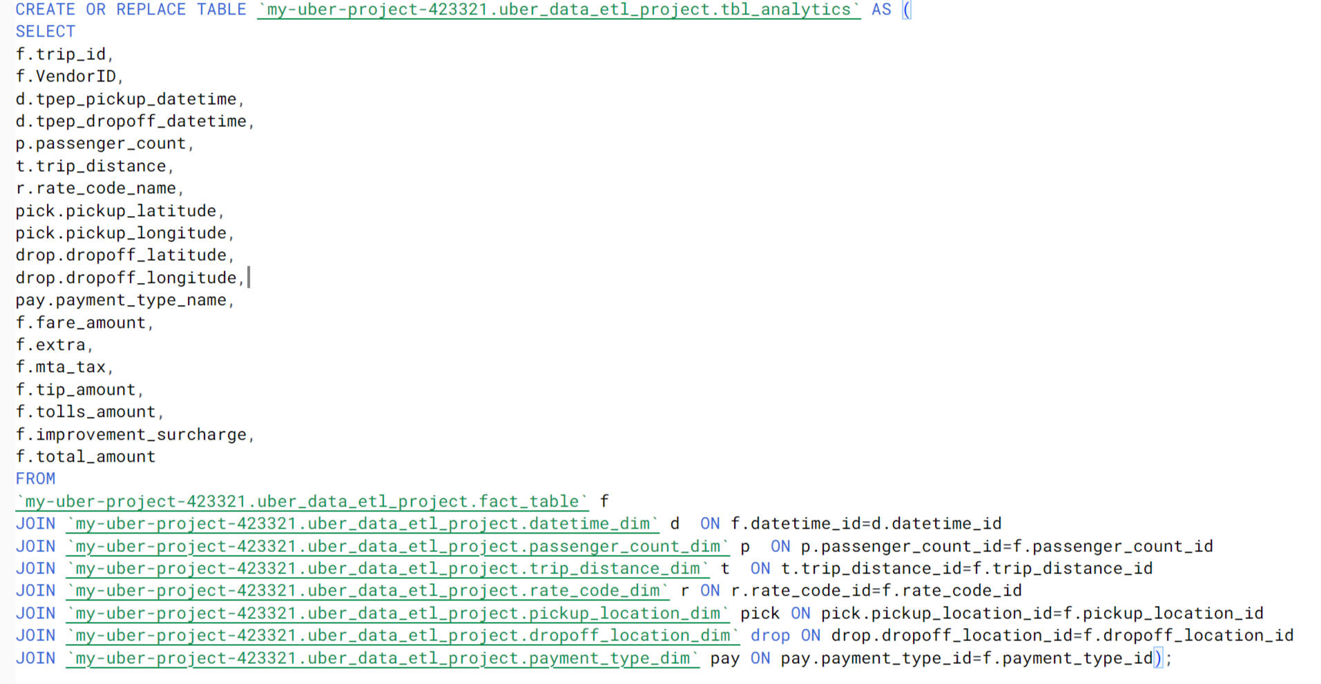
After conducting data analysis with BigQuery, I created a dedicated table for analytical purposes within Looker. The table, named tbl_analytics, integrates various dimensions and measures essential for in-depth analysis of Uber New York data. Leveraging JOIN operations, it combines data from the fact table and dimension tables, providing a comprehensive view of relevant attributes such as trip details, passenger information, payment types, and fare amounts. This structured table serves as a foundation for generating insightful visualizations and conducting advanced analytics within the Looker platform.
Data Visualization:
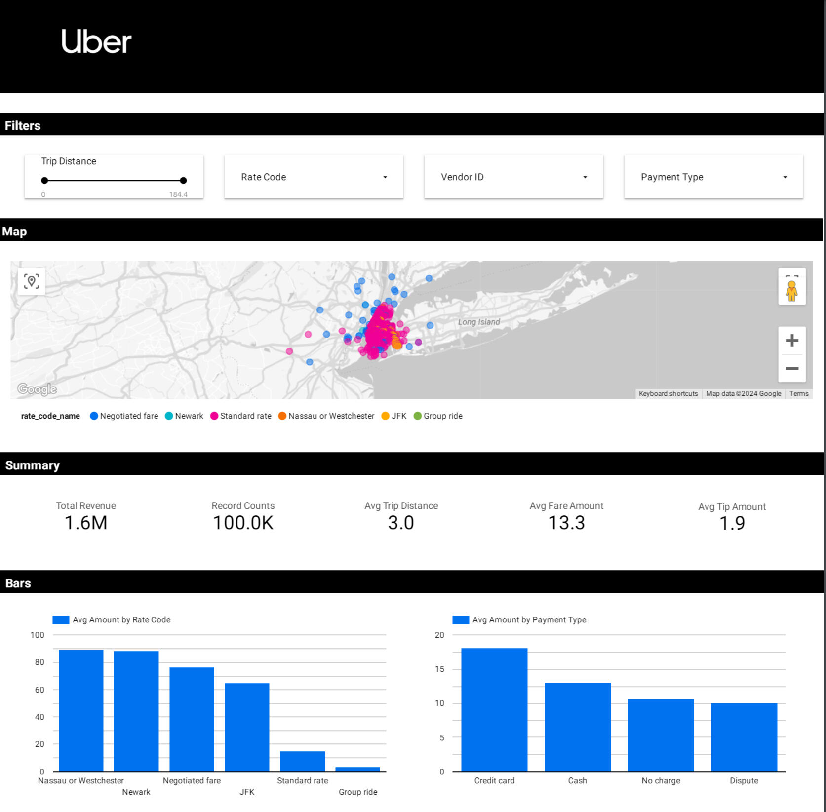
The visualization of the Uber New York data encompasses a range of interactive features and key performance indicators. A filter enables users to customize their analysis, while a map visualization depicts order locations categorized by vendor ID and zone. Crucial metrics such as total revenue ($1.6M), average tips ($1.9), record counts (100k), average trip distance (3.0), and average fare amount ($19.0) are prominently displayed. Two bar charts offer further insights: one showcasing average amounts by rate code, highlighting Nassau or Westchester as the most profitable ($90.0) and group rate as the least profitable (approximately $5.0), and another presenting average amounts by payment type, with credit card transactions leading ($21.0) and disputes trailing (around $10.0).
Dashboard: link
Tools:
- Data Extraction: Python
- Data Transformation: Python
- Data Loading: BigQuery
- Compute Engine: Mage VM Compute Engine
- Data Visualization: Looker Studio
- Data Management: Google Cloud Storage
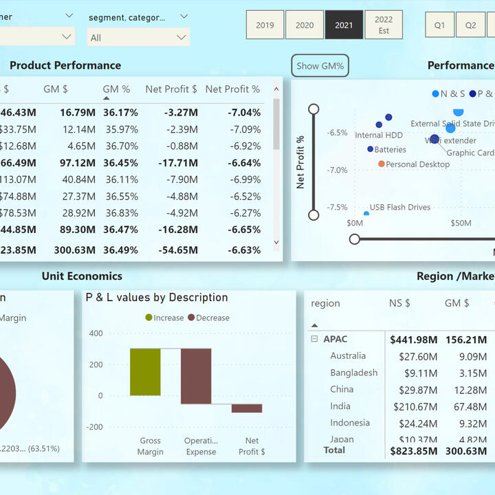
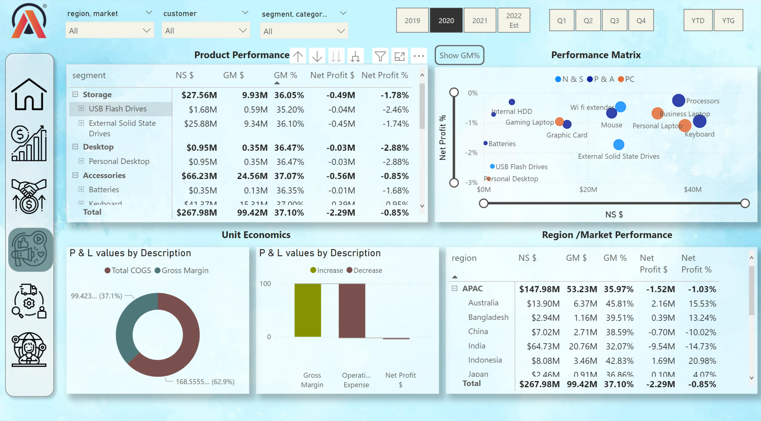
Power Bi | AtliQ Data Exploration
In this project, I am using AtliQ data. This project is entirely done in Power Bi. I cleaned up the data and connected different tables based on "snowflake data model". Data visualization is provided for five different departments in the company. The data reflects sales of the company's products in different countries through various intermediaries and directly from AtliQ. The key metrics in the project are built using the DAX programming language and Power Query.
Finanel View:
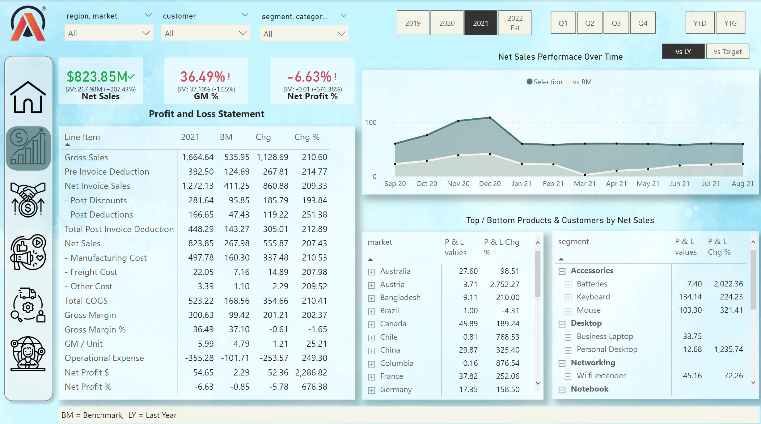
From the financial view we can see many key metrics. Also, the profit and loss statement for 4 years. We can choose the date by diffretn time stamps. On the line chart we can compare the sales data of this year and the previous year we can also see the most profitable products by category and county.
Sales View:
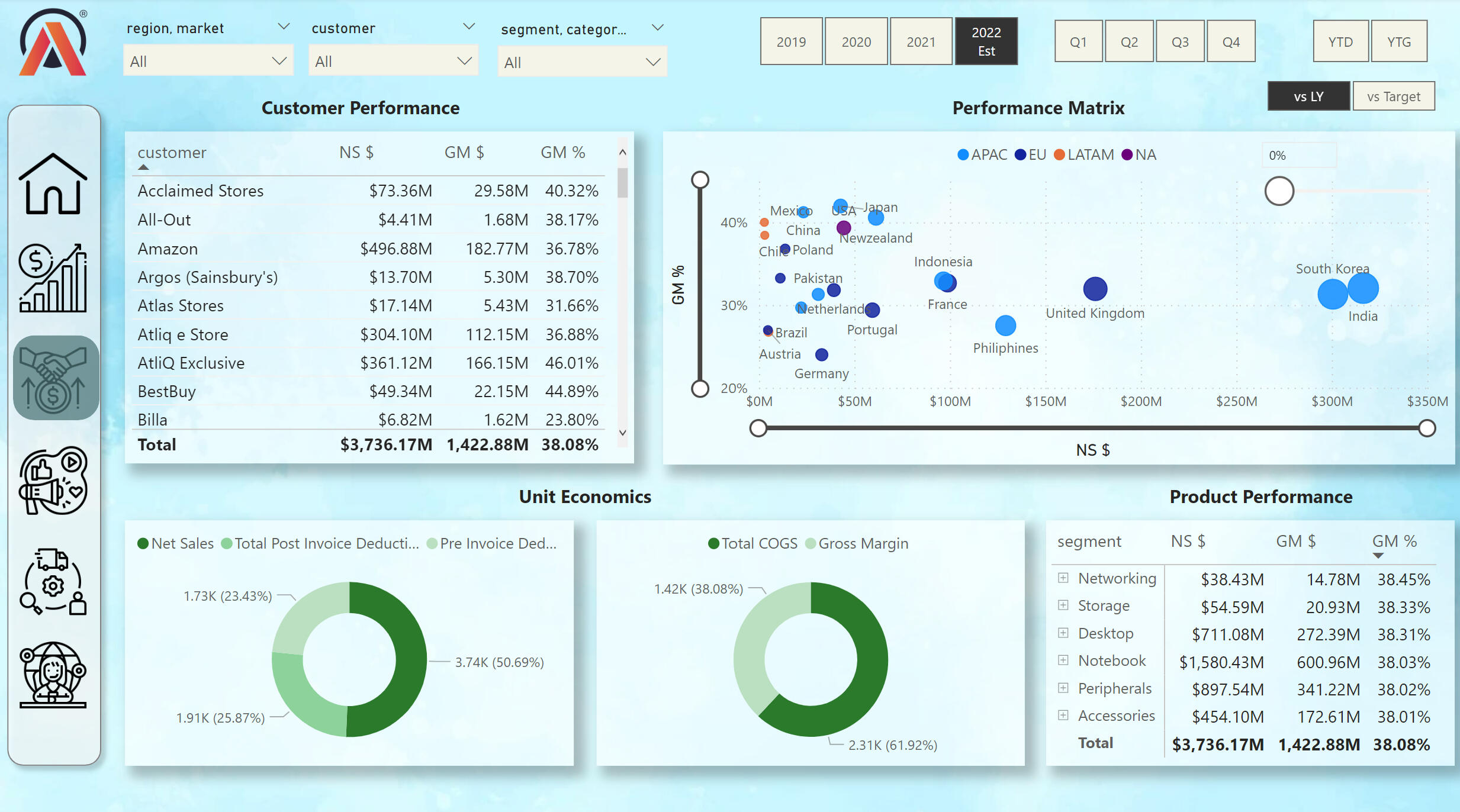
From the Sales View, we can see the performance of the company's retailers. We can also explore net sales and gross margins by different countries. We can see the most popular products among customers.
Marketing View:
Employees of the marketing department can understand from this visualization the strategy for the further development of the marketing plan for future years.
Supply Chain View:
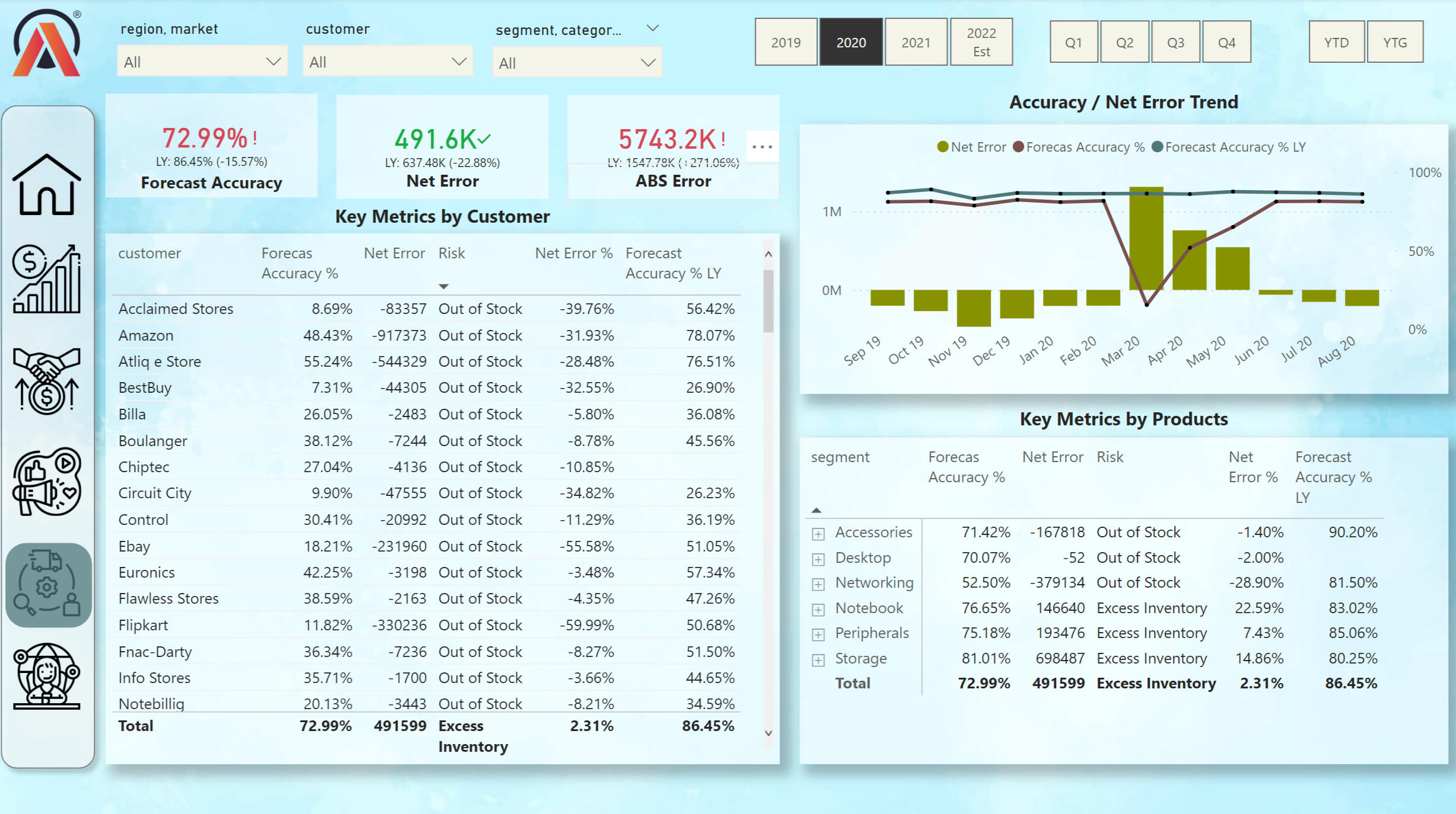
This view shows the key data for the shipping department. in the Tables, you can track the availability of goods, as well as the accuracy of the forecast.
Executive View:
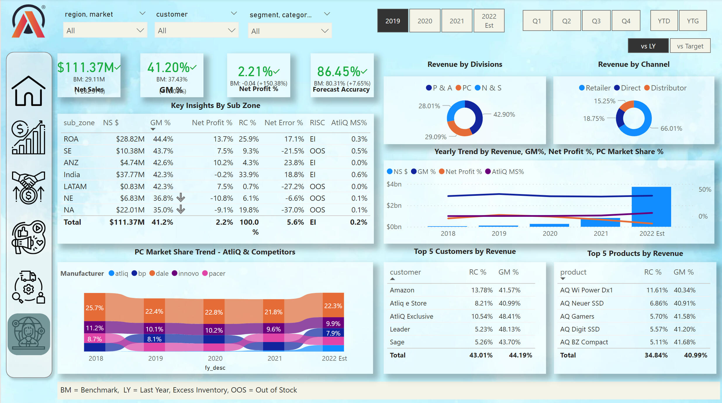
This view shows key values in different categories. On the Ribbon Chart, we can see the market share of key PC sellers between 2018 and 2022. We can also track the profit of the company according to various criteria.
I used the following skills to manipulate the data and create the dashboard:
- DIVIDE
- SUMX
- CALCULATE
- SAMEPERIODLASTYEAR
- IF
- ISCROSSFILTERED
- ISFILTERED
- Variables VAR and RETURN
- SWITCH
- HASONEVALUE
- ALLNOBLANKROW
The full project can be viewed on my Google Drive: This Project
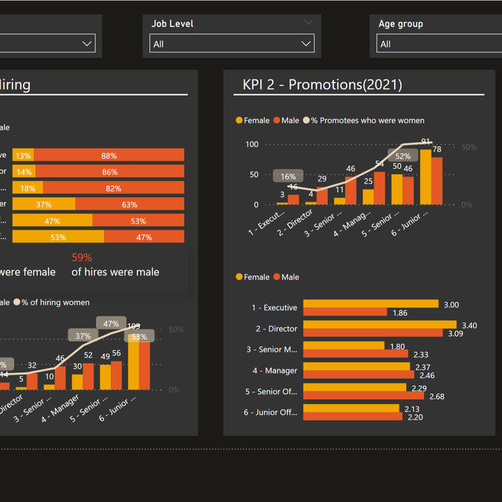
Power Bi | PWC Call Center Exploration
This view shows key values in different categories. On the Ribbon Chart, we can see the market share of key PC sellers between 2018 and 2022. We can also track the profit of the company according to various criteria.
Call Center Trends:
KPIs include:- Overall customer satisfaction
- Overall calls answered/abandoned
- Calls by time
- Average speed of answer
- Agent’s performance quadrant -> average handle time vs calls answered
Customer Retention View:
This view shows key KPIs from customer information. As well as Customer Risk Analysis. From this analysis, the customer service department can take information to work on attracting new customers and renewing current customers.
HR View:
This view shows the key KPIs of the company's employees by gender, age, region, job level, and department in the company.
I used the following skills to manipulate the data and create the dashboard:
- DIVIDE
- CALCULATE
- IF
- DISTINCTCOUNT
- COUNT
The full project can be viewed on my Google Drive: This Project
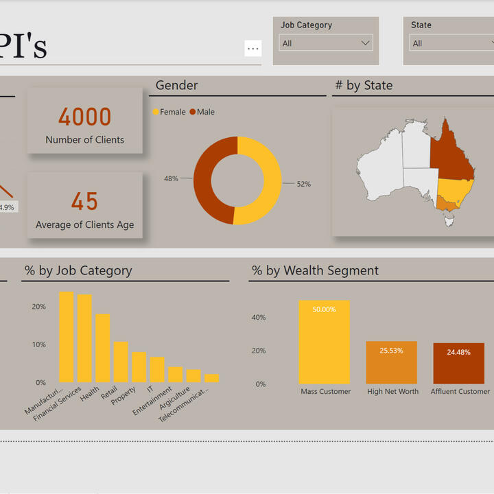
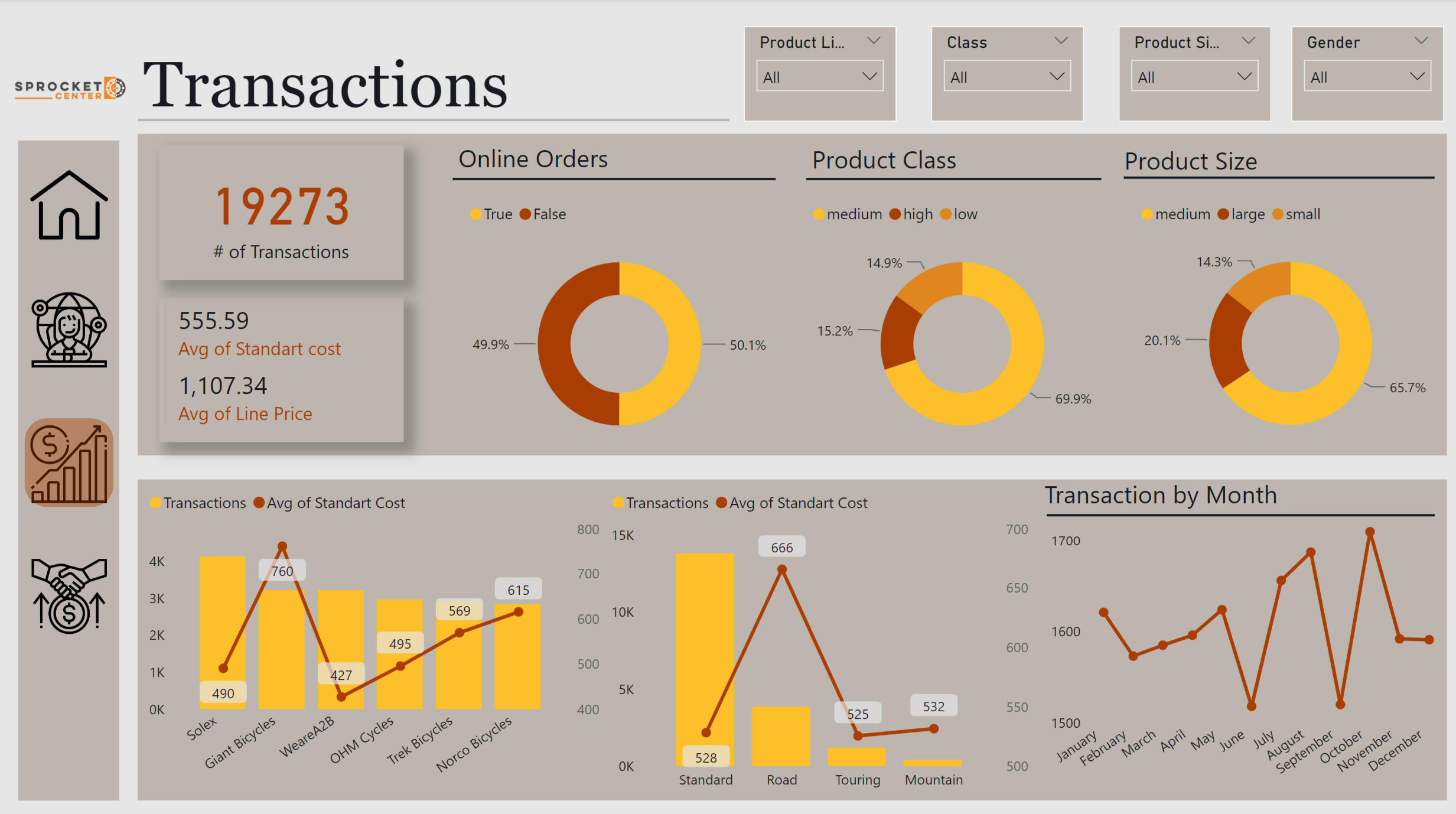
Power Bi | PWC Call Center Exploration
This dashboard shows the data of the company that sells bikes. This dashboard has three pages, on the first one we can see the analysis of the demographics of our customers. The second page shows the analysis of the transactions made by our customers. And, the third page tells us the analysis of the demographics of our potential customers.
Desired Insights:- What are the trends in the underlying data?
- Which customer segment has the highest customer value?
- What do you propose should be Sprocket Central Pty Ltd ’s marketing and growth strategy?
- What additional external datasets may be useful to obtain greater insights into customer preferences and propensity to purchase the products?
Skills Used:- Excel for data cleaning and data formating
- Power BI for visualization
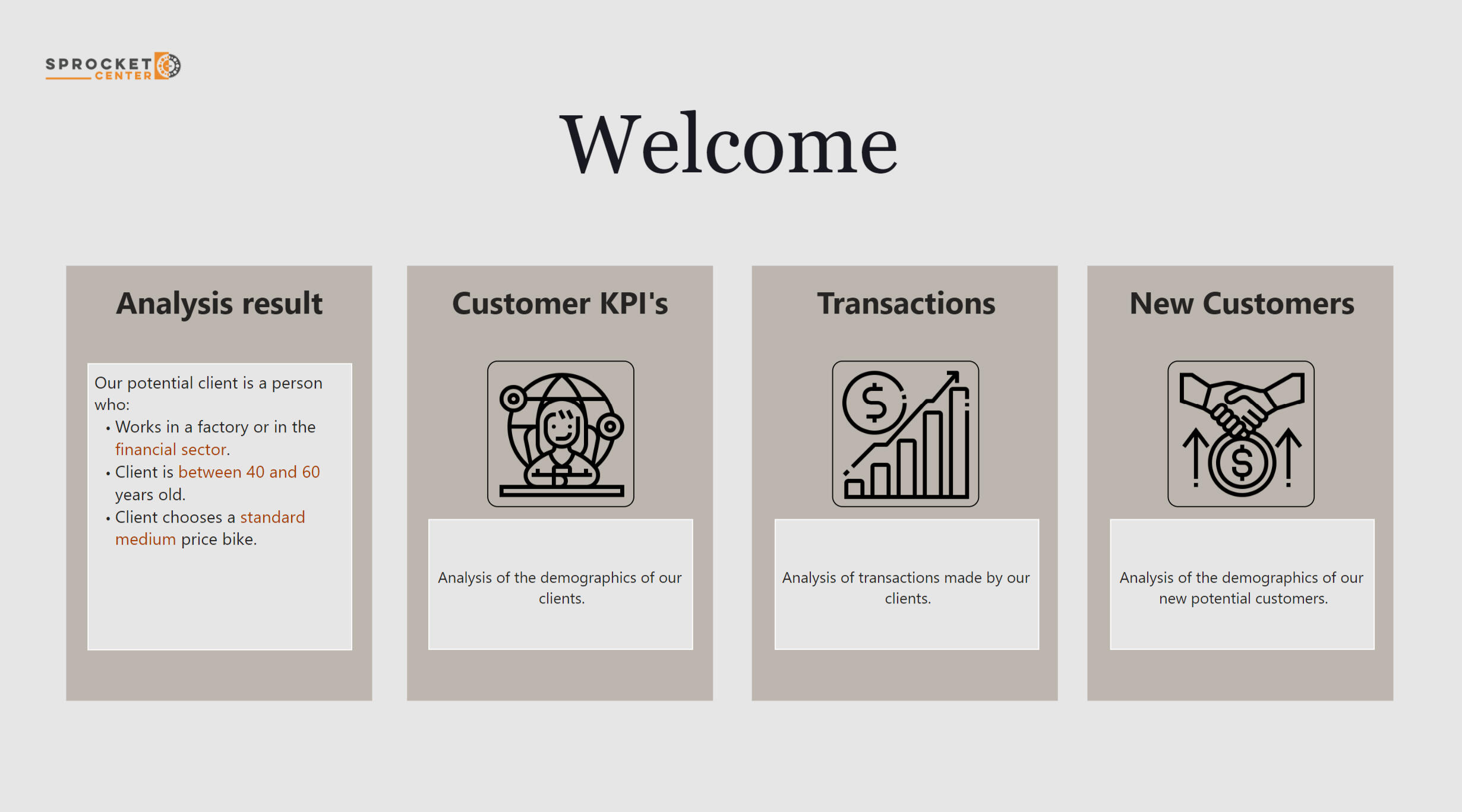
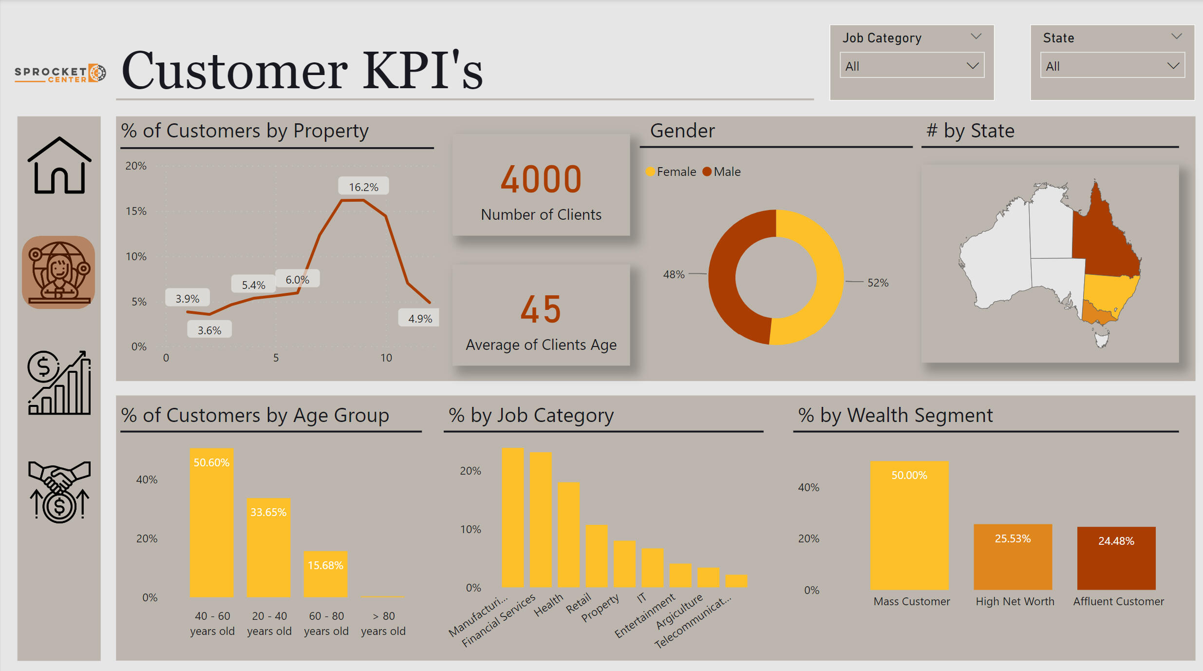
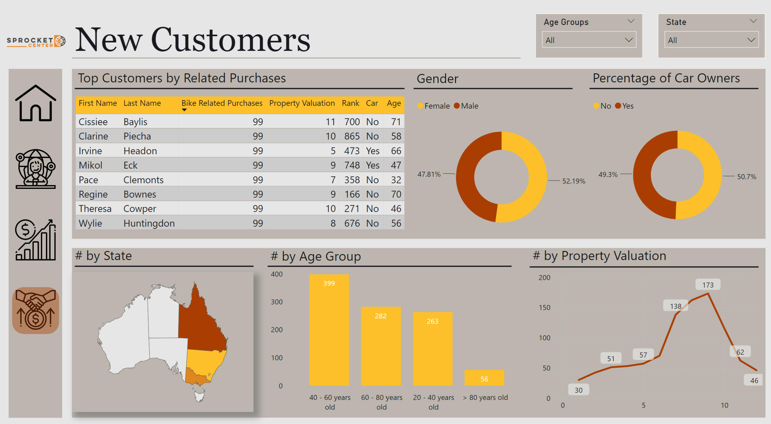
Analysis Result:Our potential client is a person who:- Works in a factory or in the financial sector.
- Client is between 40 and 60 years old.
- Client chooses a standard medium price bike.
The full project can be viewed on my Google Drive: This Project